
Jobeet - Day 21: The Design Day
 Fabien Potencier
As announced at the beginning of the Jobeet tutorial, we are holding a design contest today. The goal is to choose the default design used by Jobeet.
Have a look at the designs we have received and vote for the best one. Voting
is as simple as adding a comment on this post with the number of the design you
want to vote for, suffixed by ++. So, if you want to vote for design number
"1", add a new comment with "1++" as the content (only votes with valid email
addresses will be taken into account).
The submitted designs are ordered by date of reception in my inbox.
As we have received quite a lot of different designs and to be fair with everybody, only designs that have followed the rules qualified for today's contest.
Submitted Designs
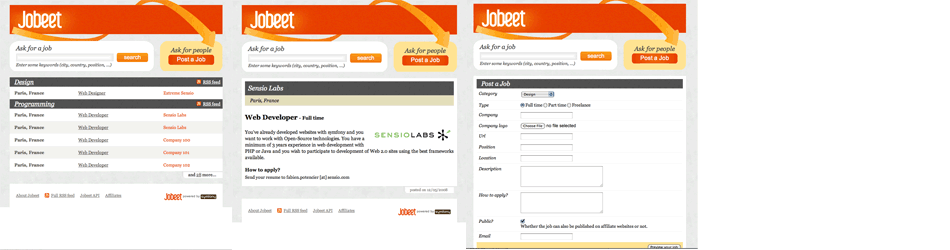
[1] Sensio
Extreme Sensio, the digital marketing department of Sensio, help famous brands define innovative online strategies in France and Europe. The symfony framework itself has been released as an Open-Source software by Sensio Labs, the technology department of Sensio. With a team of more than 50 marketing and technology experts, Sensio is one of the fastest growing Web Agency in France.
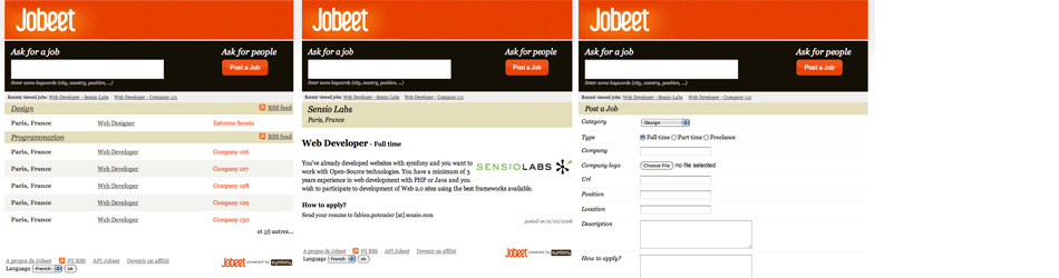
Have a closer look at the design of the four main Jobeet pages:
To vote for this design, add a "1++" comment.
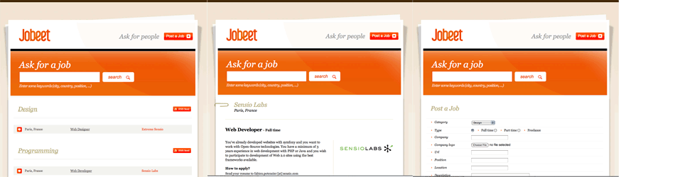
[2] P'unk Avenue
P'unk Avenue is a small, agile firm creating websites and web applications for higher education and business clients. They started using symfony in Spring 2006 to build better, more reliable web sites faster. Since then they have embraced it as their standard development platform for all projects, pushed for its adoption at several major academic institutions, and released plugins like
sfShibbolethPluginandsfTagtoolsPlugin.
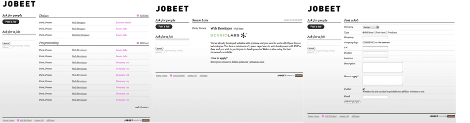
Have a closer look at the design of the four main Jobeet pages:
To vote for this design, add a "2++" comment.
[3] centre{source}
centre{source} is a full-service interactive firm assisting organizations that view the web as a strategic asset. They provide their clients four essential services: strategy, planning, execution, and on-going management.
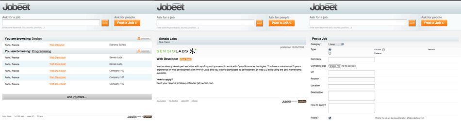
Have a closer look at the design of the four main Jobeet pages:
To vote for this design, add a "3++" comment.
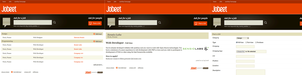
[4] OrangeD
David Gorges is a 22 year old student of computer science in media on the University of Furtwangen, Germany. He started using symfony within a university project and got stick with it.

Have a closer look at the design of the four main Jobeet pages:
To vote for this design, add a "4++" comment.
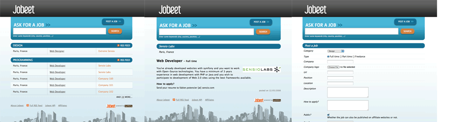
[5] Mathijs Beks / qube
Have a closer look at the design of the four main Jobeet pages:
To vote for this design, add a "5++" comment.
[6] Eduardo Martinez Cobos
Have a closer look at the design of the four main Jobeet pages:
To vote for this design, add a "6++" comment.
[7] Christophe Nguyen / Studio Mitsuné
Have a closer look at the design of the four main Jobeet pages:
To vote for this design, add a "7++" comment.
[8] centre{source}
Have a closer look at the design of the four main Jobeet pages:
To vote for this design, add a "8++" comment.
See you Tomorrow
We will keep the vote opened for a few days, and announce the winner later this week.
Tomorrow, we will resume our tour of the main symfony features by talking about the symfony cache framework.
See you tomorrow for the last week of the Jobeet tutorial.
Help the Symfony project!
As with any Open-Source project, contributing code or documentation is the most common way to help, but we also have a wide range of sponsoring opportunities.
Comments
Comments are closed.
To ensure that comments stay relevant, they are closed for old posts.
8++
8++
7++
8++
I like #5 for being the only to style the form elements in the Job creation page, unfortunately, the top of the page breaks in IE.
This contest was supposed to be in good fun and it's not fair to everyone when designs are in the competition that did not follow the requirements for entry.
That's the one I find visually the most pleasing, although I must say there's a lot of screen space wasted in all the designs. Many feature just the JOBEET logo and then nothing else in that line. On my laptop @1024x768 it feels like roughly half of the visible area is covered by 'header' stuff. Please consider making it more compact and even smaller on pages that are not the homepage.
Waining for your check JWage :p
8++
I thought that there were going to be more designs, nevertheless, everyone is great.
Don't get me wrong, I didn't submit a design so I shall shut my mouth but there is this attention to detail that is so missing here. Cheers, Daniel aka annis
btw I voted for 2, because it as the only design looks really professional, it's like absolutely clean :)
People maybe like 8, because it has nice colors and everything, and I'm sure it will get fixed :)
casting this just to race #8 :)
but my heart goes to 5++
Anyway my vote goes for #5.
5++
I like the expanded width, the clear colours and interesting but non-obtrusive design. Still, lots of good ideas in all entries!
Awesome job centresource
http://www.symfony-project.org/blog/2009/01/11/jobeet-design-contest-winner