A few weeks ago we introduced the redesigned debug toolbar for Symfony 2.8. The new toolbar was well received by the community, but it had a major shortcoming: when you clicked on any toolbar panel, you were redirected to the old profiler.
That's why the day after introducing the toolbar, we started working on modernizing the look and feel of the profiler to match the new toolbar. A month later, and after having changed more than 5,000 lines of code, we are proud to introduce the redesigned Symfony Profiler.
The redesign process
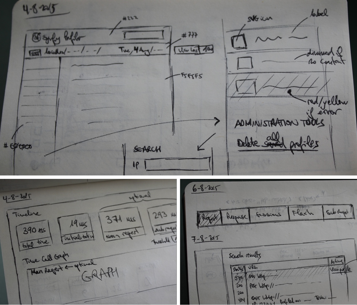
This daunting redesign, like most design projects, started back in the drawing board. We prepared dozens of paper mockups and sketches to rethink all the elements rendered in the profiler pages:
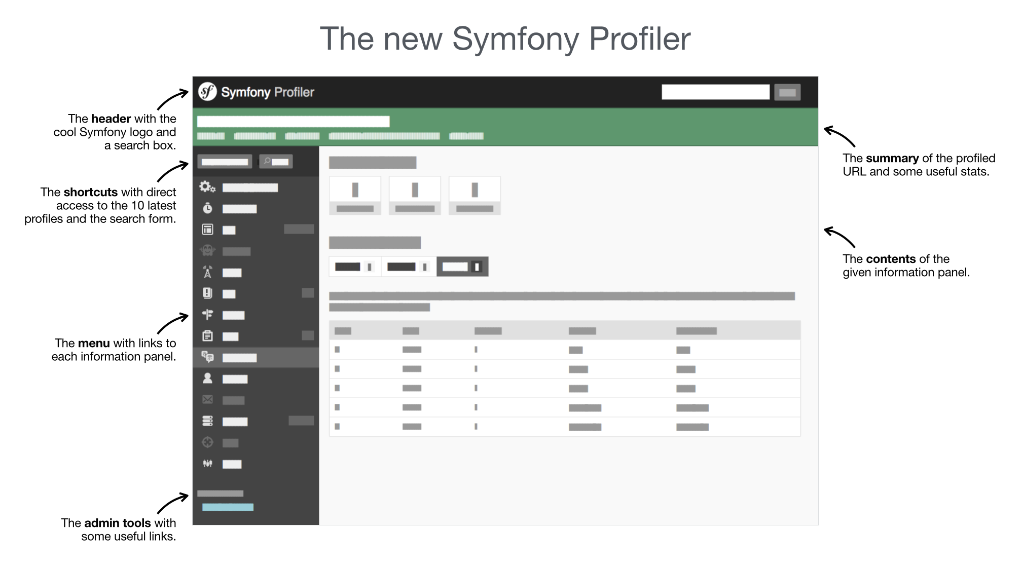
The next step was to prepare the wireframe of the layout on which profiler pages are based. Again, a lot of designs were tested and eventually, we decided to use the following layout:
The final step was to redesign all the profiler pages. Instead of just updating their appearance, we spent more than 100 hours in total rethinking each and every of their contents.
Explaining the full set of changes would take us too long, so we prefer to show you four quick comparisons of the old and new profiler:
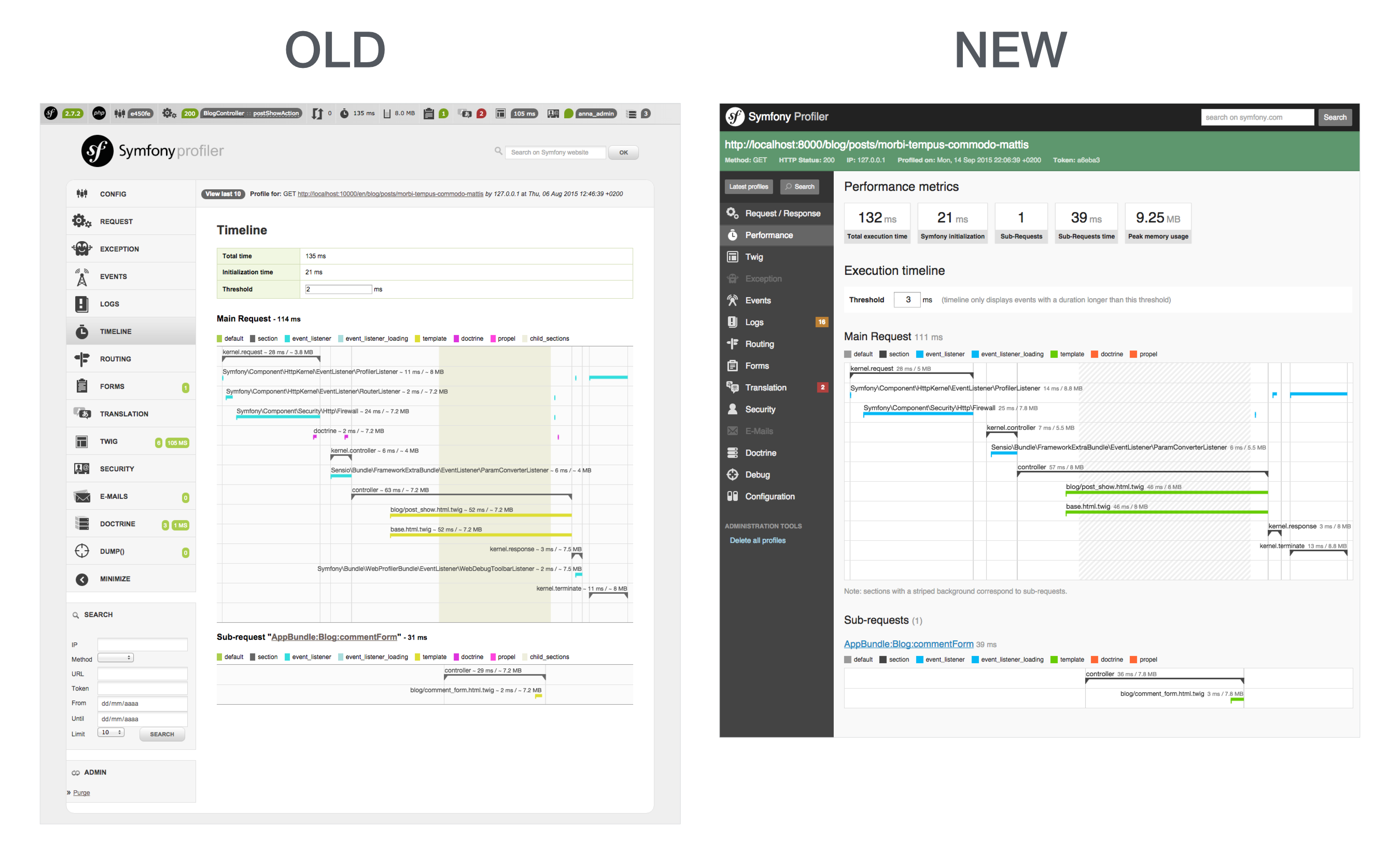
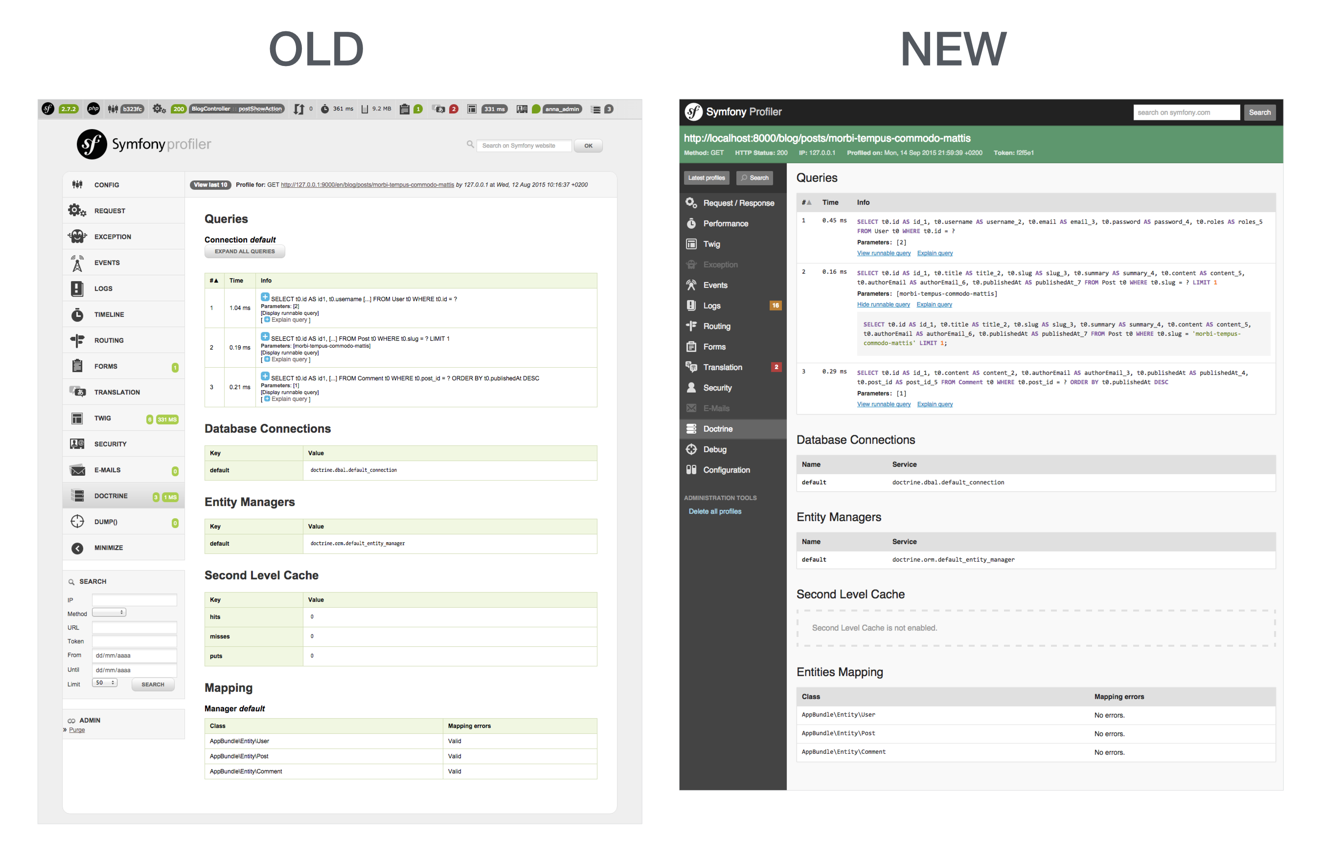
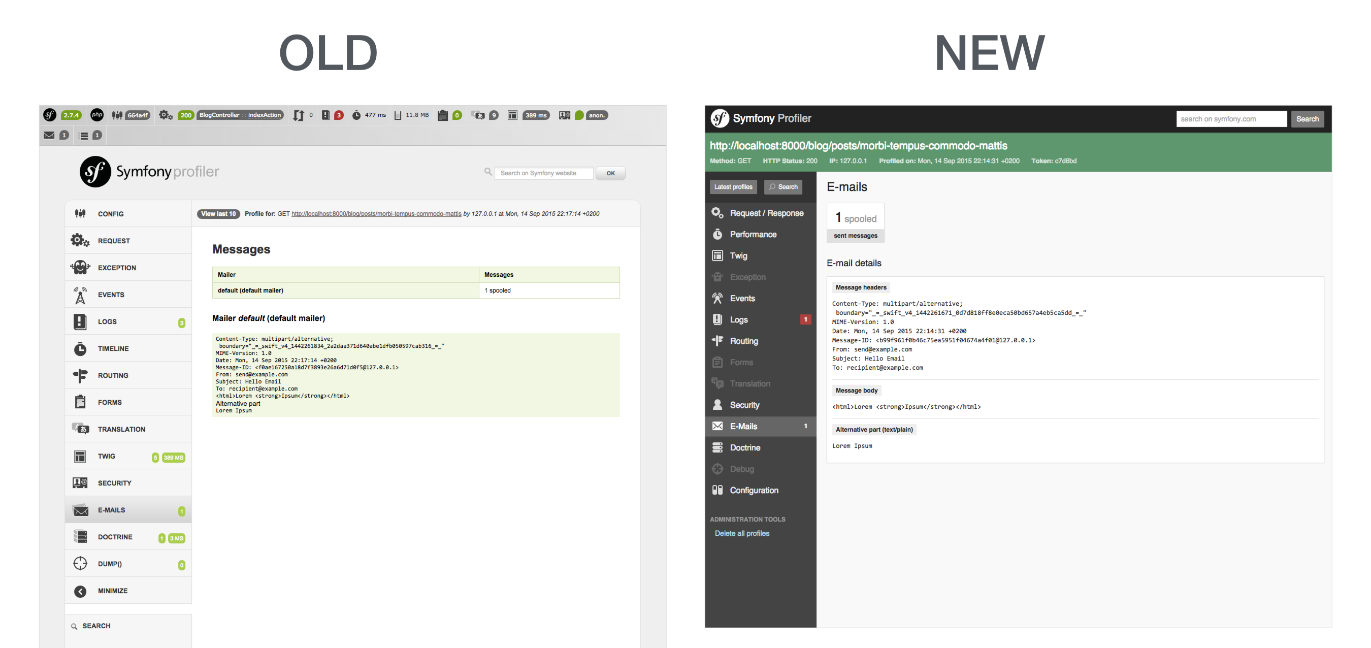
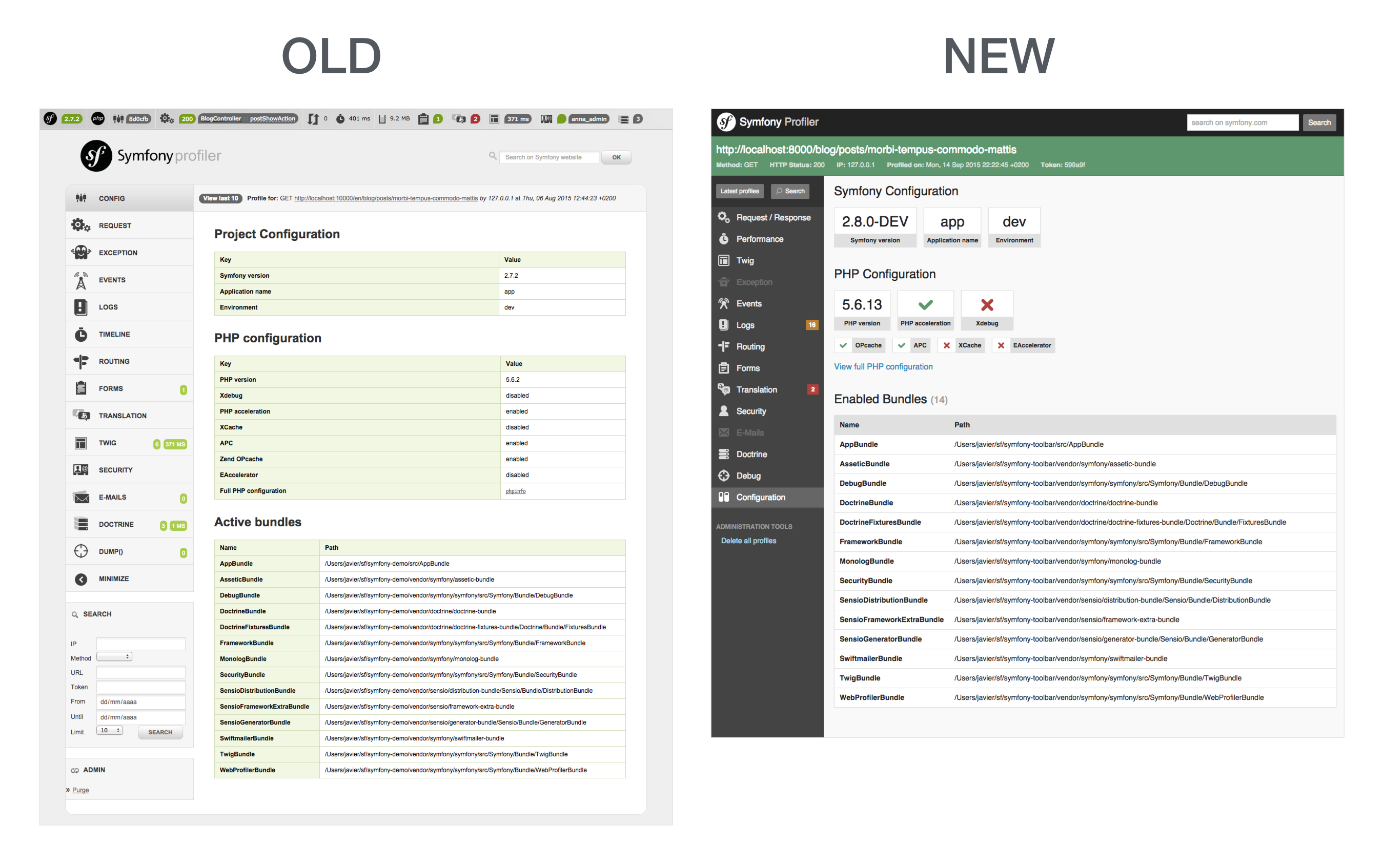
Check out the original pull request to know all the details about the new design.
How can you get the new profiler?
The new profiler will make its debut in Symfony 2.8 and 3.0, which will be released
on November. The redesign will also be available in the next Silex releases.
Meanwhile, you'll have to use the 2.8.*@dev dependency version in your
composer.json file.
If you want to test it as quickly as possible, create a new Symfony project executing the following command:
1
$ composer create-project symfony/framework-standard-edition new_profiler "2.8.*@dev"
This new redesign is very sleek, awesome work everyone involved.
Bravo. C'est bien plus fonctionnel que le profiler actuel et plus simple à appréhender visuellement.
Very nice, really !!
One thing that really annoys me in the profiler is that HTML body of a sent email is raw. What about adding a way to preview the actual HTML content?
Great job !
+1 Massimiliano Arione
Very good jobs. Thanks.
+1 Massimiliano Arione It should be easy enough to create a pop-up window and inject the email HTML in it.
nice work ! Thanks :)
Great redesign! Well done ;)
very nice ;) gj
Wow I love it! Thanks for great work! This new look is legendary.
Thanks you very much, it's an amazing job!
Great Job, guys! Absolutely love it. Cannot wait to try it.
Superb. Great job guys! Cheers!
So a flat design is now really in, looks really good, the pastel colors are perfect.
Very nice! Thank you guys.
Great Job, it's nice to have a fresher view, but now it would be nice to have the symfony error page to match this new flat design too
That's awesome!!!