Symfony provides a Bootstrap 4 based theme as one of the optional themes you can use to style the application forms. In Symfony 4.4 we've improved it with support for Bootstrap custom switches
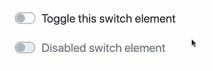
Switches, also called flip switches and toggles, are a way to style regular checkboxes to make them look more modern and dynamic. You've probably seen them in lots of smartphone applications and web sites:
To use them in your Symfony forms, make sure to enable the Bootstrap 4 theme and
add the switch-custom CSS class to the label of any CheckboxType form field:
1
2
3
4
5
6
7
8
9
10
11
12
13
14
15
16
17
18
namespace App\Form\Type;

use Symfony\Component\Form\AbstractType;
use Symfony\Component\Form\Extension\Core\Type\CheckboxType;
use Symfony\Component\Form\FormBuilderInterface;

class BlogPostType extends AbstractType
{
    public function buildForm(FormBuilderInterface $builder, array $options)
    {
        $builder
            // ...
            ->add('published', CheckboxType::class, [
                'label_attr' => ['class' => 'switch-custom'],
            ])
        ;
    }
}
Published in
#Living on the edge
Nice. Thank you!
What about file inputs - I still dont like the bootstrap custom file input, and the custom-file-input class is hardcoded in the template :(
https://github.com/symfony/symfony/blob/4.4/src/ Symfony/Bridge/Twig/Resources/views/Form/bootstrap_4_layout.html.twig#L136
@Martin, that's a very good point: we are not being consistent, sometimes custom inputs are forced, sometimes they are not. It sounds like it should be changed for something easier to understand.
@Martin, it's due to the Bootstrap documentation, in the doc you only have the customize file input. But they expose 2 possibilities for checkboxes, and for radio (now 3 with the toggle).
That's why when the custom inputs for checkboxes and radios were implemented we have permit the availability to choose (with the default on non-custom). But the input file was implement before, and force the custom field.
https://getbootstrap.com/docs/4.3/components/forms/#checkboxes-and-radios https://getbootstrap.com/docs/4.3/components/forms/#checkboxes-and-radios-1 https://getbootstrap.com/docs/4.3/components/forms/#file-browser
Good game, thanks! before I did that with the block_prefix property (with custom field block), now it'll be even simpler :)
Good, thanks !!!
@Mathieu
True, that Bootstrap only have this single file input - but what a mess it is (UX-wise)
This is something that a normal browser file input easily can.
Right now, the only way to remove this is by removing the custom-form SCSS from bootstrap (but this also removes the custom check/radios).
So I would really want some how that "custom-file-input" (its fine its enabled by default)
@Martin
To my knowledges, with a default file input like https://developer.mozilla.org/en/docs/Web/HTML/Element/Input/file, the only missing behavior is to diaplay the selected file name due to the theming (it's common to lot of file input customization).
You easily can do that with this javascript snippet:
$('.custom-file-input').on('change',function(){ var fileName = $(this).val(); $(this).next('.custom-file-label').html(fileName); });
Great! Thanks Romaric
Such a great thing ! Thanks !