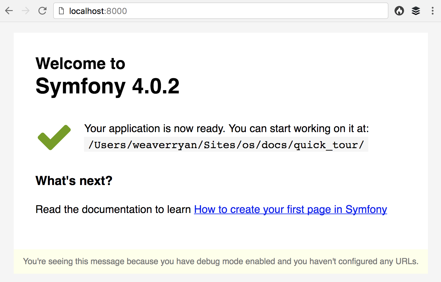
When you browse a newly created Symfony project, you see a special "Welcome page" that looks like this:

Although this is an error page (you are seeing that page because you haven't configured any URL yet) we designed it to make it look more friendly than a traditional error page, specially for newcomers.
This page confirms you that Symfony was successfully installed, shows the directory of your application and provides a link to the most essential documentation for newcomers: How to create your first page in Symfony.
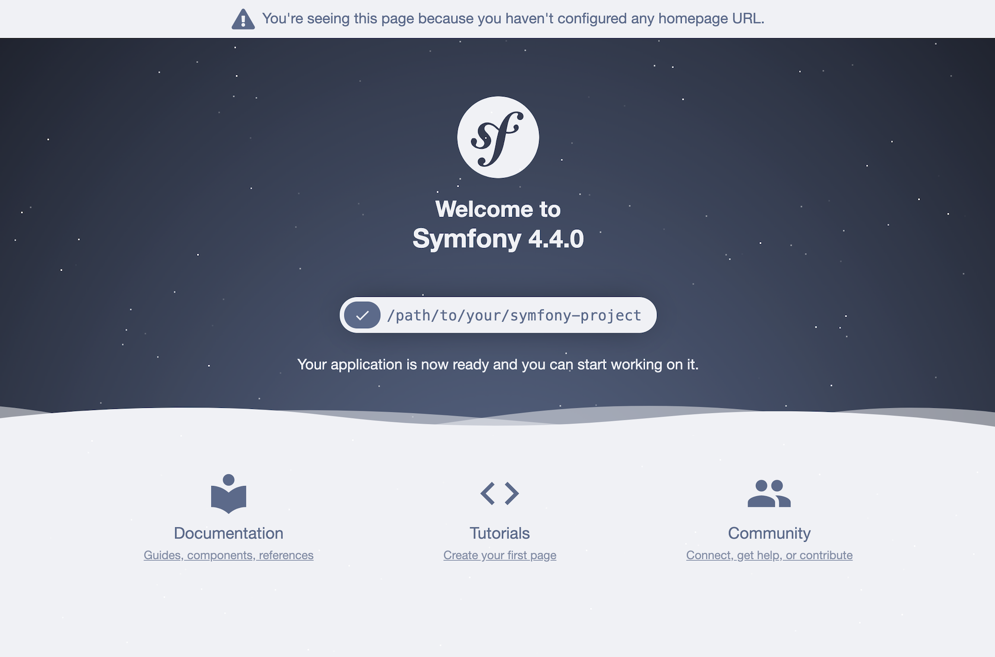
Even if this page is correct, its design was dull and uninspiring. That's why we decided to redesign it for Symfony 4.4/5.0. This is how the same page looks now:

In addition to having a much better design, the page now provides more links to useful resources. Also, the main page color will randomly change each time you load the page, so keep reloading until the color matches your preferences.
Great improvement! Thanks Yonel Ceruto for this contribution!
Wow, this looks really nice! Great work.
Really nice page. It really needed it ^^
Please add some randomly falling stars to the sky in the background :D
Looks nice!
Is the image of new welcome page released under a friendly license? I ask because I'd like to add it to wikipedia
@Massimiliano yes, the image is part of the Symfony Docs, so it has the same permissive and non-copyrighted license:
You can get the best image quality here: https://github.com/symfony/symfony-docs/pull/12507
The new form is certainly prettier but I think you should make it more clear that it is indeed an error page. The "you are seeing..." portion should be in bright red and a much bigger font emphasizing that you really need to define some routes. Questions about this page show fairly frequently on stackoverflow and many developers express surprise that it is actually an error or wonder how it got there when routes are defined. Either that or add a default controller with an index action route back into the skeleton.
This looks soooo good! Great job!
This is awesome!
@Art Hundiak, it could be argued that this is indeed a success page, since most often the only time you see it is when you have successfully installed Symfony.
It looks really good! Nice improvement! :)
Great job!
Wooooow <3
wow looks much better!
Nice looking page. But I find the warning message too "shy"...
Nice.