Lately we've been busy improving and adding features to the symfony.com website. This article recaps the most important new features.
See past events and add events to your calendar
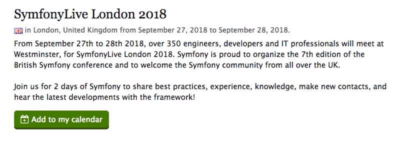
The Events & Meetups section, where anybody from the community can publish their Symfony-related events, has been improved to show all the past events. This will give more visibility to the community events and it will help you find events celebrated near the place you live.
In addition, submitted events now must define their timezone. This allows us to
display an Add to my calendar button to the upcoming events. This button
downloads a *.ics file to add the event to your Google, Outlook or Apple
calendar:
Filter "New in Symfony" posts
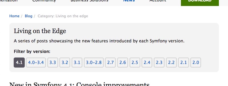
Living on the Edge is the most popular category of our blog. It mostly contains "New in Symfony" posts explaining the new features added to each Symfony version. Sometimes you need to browse the new features of past Symfony versions, for example to check when a certain feature was added.
That's why we've added a "Filter by Symfony version" feature to help you browse those past Symfony versions:
Give contributors more visibility
Symfony is lucky to have thousands of contributors and we want to highlight their work more prominently. That's why in the footer of every symfony.com page you'll see a randomly picked contributor:
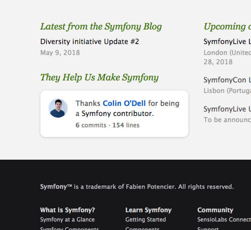
A different contributor is shown on each page reload, so you can try to reload the page until you see yourself featured on symfony.com (keep in mind that some pages are cached and the contributor doesn't change for a few minutes).
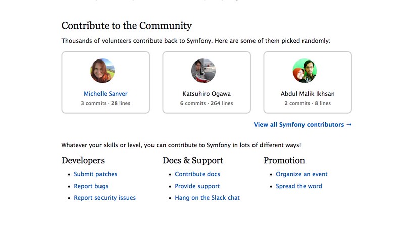
Related to this, in the Contributing section of the main Symfony Community page we now highlight some randomly picked contributors:
Diversity and inclusion
A recent blog post explained the latest diversity initiative updates, such as the adoption of a Code of Conduct and more. This diversity initiative is here to stay, so we are slowly improving symfony.com around it.
First, there is a new Symfony Diversity category in the official blog, so you can easily stay updated about it. Also, there is a new Diversity and Inclusion section in the main Symfony Community page with links to the most important resources related to that topic.
Diversity and Inclusion is also about making people with disabilities part of the community. That's why accessibility is an integral part of diversity. During the past months we've been tirelessly fixing web accessibility issues, tweaking colors to increase their contrast, making forms friendly to screen readers, etc.
The result, as measured by the A11yM accessibility test service is that we've fixed more than 2,000 accessibility errors on symfony.com during the past four months. There's still lot of work to do, but we're on the right track.
A new "dark theme"
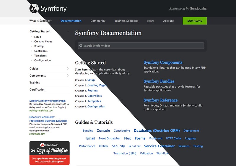
The design of symfony.com is based on a pure white background which creates a clean and minimalist experience. However, some people don't like that because it's too bright in low light conditions and it can even cause headaches to them after long exposures (e.g. when reading the docs).
That's why we've introduced a new "dark theme" / "night mode" that changes the design to a black-based color palette. Click on the "Switch to dark theme" link at the bottom of the sidebar to test it in your own browser:
That's awesome changes! ❤️ Thanks Javier
LOVE the dark theme! Cheers!
I love these news, thanks for taking care of website more frequently in recent months!
Btw, for "add to calendar" link: is there a way to make it work for Google Calendar?
Can you fix twitches while scrolling? just add that css: .affix-top { margin-bottom: -40px; transition: none; } #content_wrapper > .container { padding-top: 40px; } also it fix scroll to anchor position
It would be cool to open the source code, so we can try to contribute that site :)
There is a small issue with the nav btn on the mobile version. It's almost invissible in night mode. :)
I prefer the docker dark theme https://docs.docker.com/...
Seeing more than just one blog entry post at the bottom of the website was very handy for me. Now I have to make extra clicks to see what's new.
@Sergey we've made some changes to "anchor links". I tried your CSS code but I couldn't make it work, so we tweaked our existing JavaScript code instead. Please test it in your browser and report any issue. Thanks!
With js fix, anchor positioning work great. But i think that a proper solution is only with css. Start scrolling and then "header__bottom" change class from "affix-top" to "affix" and this block became fixed, then the main container jamping up under the affix section. Check that my css wasn't overrided and it should work, because i use it every day with "custom css" chrome plugin. By the way. There is an another simpliest css solution "#content_wrapper > header { min-height: 130px;}". This work even better because it doen't change the transition property
@Sergey I'll keep looking at this. However, I think we'll stick with the JS solution because it allows us to apply a cool animation when scrolling to the anchor link.