Today we are proud to introduce the most significant symfony.com update in the last four years. As announced during the last SymfonyCon 2013 conference, in the coming months the official Symfony website is going to be redesigned section by section.
A bit of Symfony history
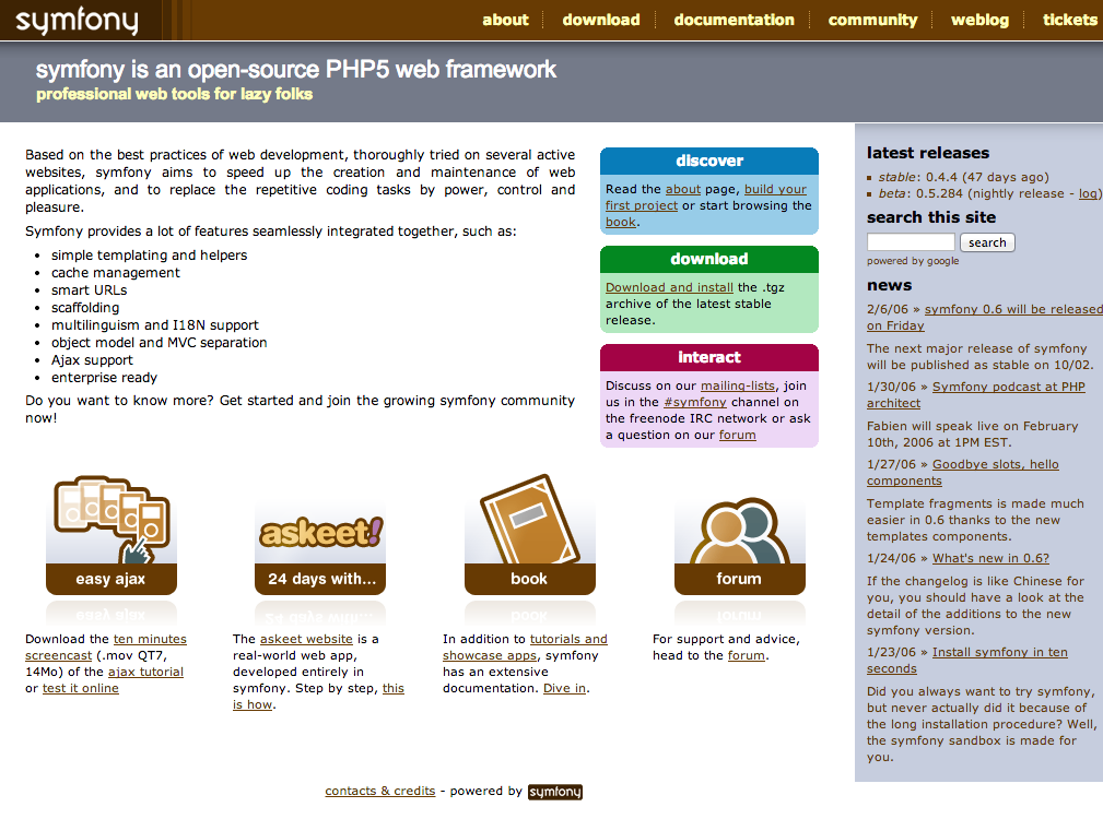
Although the symfony-project.com domain was registered on August 30, 2005, the oldest symfony website capture on Archive.org dates back to October 2005, when the project's main color was brown and the latest Symfony version was 0.4.1:

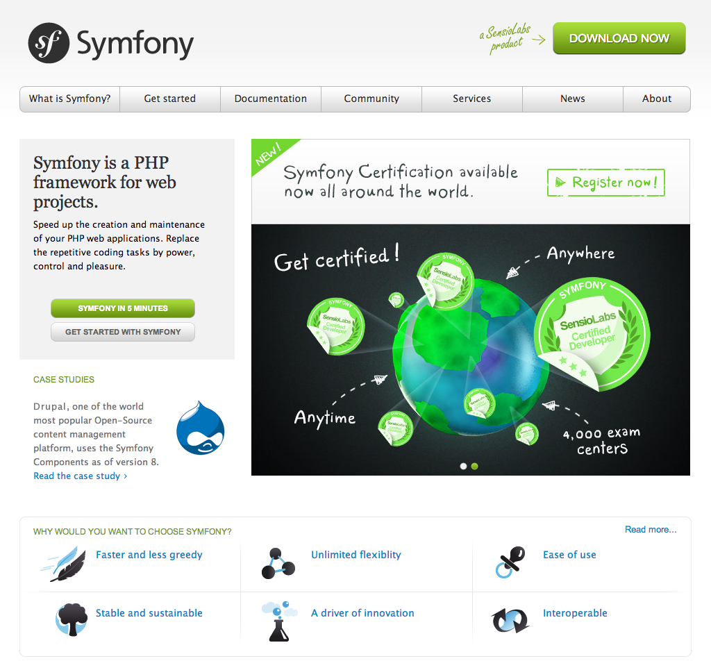
The big change was introduced on March 2011 when Fabien unveiled during his Symfony Live 2011 keynote the new symfony.com domain, the new project branding and the new website design:

The new website
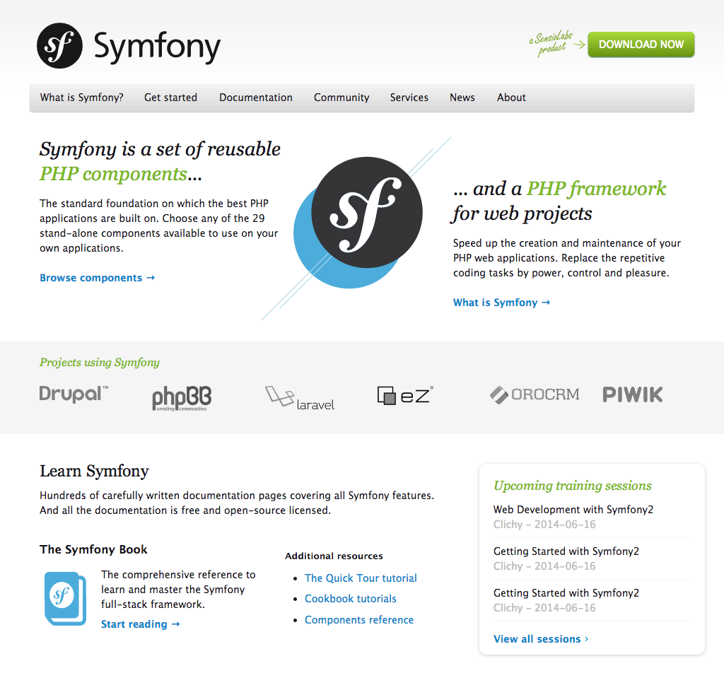
Today we are introducing the third big redesign of the Symfony website:

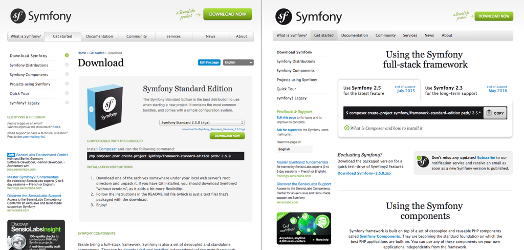
As you can see, the new website maintains all the design and navigation elements that you know and love, but updating and modernizing them. Take a look for instance at the Download page update:

The new Download page drastically simplifies the original contents to help you get started with Symfony easily and as soon as possible. In addition, it tweaks and updates every single design element while maintaining the original look and feel of the website. As expected with any modern web design, the new website is also fully responsive, which greatly improves the browsing experience on tablets and phones.
The introduction of this redesign is just the first step into the whole website update. Some of the least visited pages haven't been redesigned yet and some planned new contents are still missing. However, before continuing with the upgrade, we prefer to receive first your feedback about this redesign. We are specially interested in reading your critics about lacking features or anything that just doesn't work or feel right. After all, this website is made for you!
Finally a responsive website. Good work!
Nice one. Especially the better overview of (LTS-)versions and the different components. Like the responsiveness ;)
Little typo: It's the third design, but the second update of the website, isn't it?
Besides that: Responsiveness is great. I need to move around on it a bit longer before providing usefull feedback.
@Wouter fixed the typo about the number of updates/redesigns. Take your time to provide us feedback about the new website. We are eagerly waiting for it :)
Great work! Thanks Javier :)
Hello, no PDF documentation downloadable for 2.5 Reference and Bundles books ? Pleaaaaaase, need them, no Internet at work !
Thanks :-)
Nice! One suggestion: make it wider than just 970px. I've installed Stylebot to make it 1300px wide.
@Stephan since we use Bootstrap 3, at first we used a fourth CSS breakpoint for large desktops. However, we didn't like at all the ultra-wide design and for that reason we limited the maximum page width to the classic 970px.
Anyway, once we tweak and polish the current redesign, we'll reconsider again introducing the design for large desktops. Thanks for your suggestion!
I like the new design, great work!
@troudbal The PDF were available but the select box was not updated. That's fixed now.
Good job!
I like that you have dropped the slideshow on the homepage, shows that you know what your main message is. Generally cleaner, but agree I would like a wider breakpoint.
I love it. Very nice.
I guess I have to disagree with the masses. I dont like how there is no border on any container and the plain white on black approach does not look professional enough.
great
Nice. However it could be better if it was still possible to download the last symfony releases, in order to allow the project preparation made by Netbeans (it requires the ZIP file somewhere in the PC).
@Alessandro, all the past Symfony versions are still available to download. However, in the Download page we only show the latest version: http://symfony.com/download?v=Symfony_Standard_Vendors_2.5.0.zip
If you set another version number in that URL, you can download the ZIP for any version. I know it's a bit "hackish" to download specific Symfony versions that way, but we'll wait for more complaints before reintroducing the select list.
Congratulations, it is awesome the good work you are doing!!
I retire my complaint, the site is beatiful as it is now. I should have realized by myself how to get the old installation files!
Wonderful piece of work!
Great work! Love it already
The new site is very nice but I have one small issue. The fixed bar at the top is rather large on mobile, especially when filling in forms such as .. now. I can't help but think it could be halved in height and still be perfectly useable but not dominate my screen.
HTC one x
Responsive is really good. Same remark about the fixed bar. Could be a bit thinner to read more doc :)
It should be interesting to add to Symfony Project the most used bundles :
SonataAdmin FosUserBundle etc...
Thanks
@Doug Hayward @Javier Eguiluz
I think this is a 'bug': the #header-bottom should be "top: 0" on "xs" screensize. It's now "top: 36px".
There's also an issue with the SensioLabsNetwork bar in mobile browsers. Maybe hide it on mobile devices?
That looks truly great, good job Symfony Team! :-)
There is now a big white bar above the nav bar. Also I think it would make sense from a user point of view if the comment box was below the comments not before. As it is currently you scroll down reading the comments and then must scroll back up in order to find the comment field.
The new web look awesome ! symfony forum should update the same style.
Thanks for symfony team for hardworking
I just noticed the "floating menu" when you scroll down. Killer feature!
Nice change. Now it's looks nice on smartphone . In Community should be category " Links" (or something like that) with links to some usefull stuff like (for example) https://packagist.org/, http://knpbundles.com/,http://www.symfony2-checklist.com/
Why don't you use the same style for the menu on mobile displays? I don't like the black nav on mobile phones and I think it'll not be very hard to make the new nav bar responsive.
There is still an issue with the floating menu. When it become 'fixed' an extra padding should be added to the page (content_wrapper).
When you scroll down slowly, weird things happen.
Under chrome, impossible to selecting the scrollbar and scroll. Bug with the menu. Tested with others people.
I agree with Dirk Luijk, the behaviour of the menu bar is incredibly annoying while scrolling down the first part of the page.
Thanks for reporting these issues with the new website. I've prepared a short clip showing the right behavior of the header and menu: https://www.youtube.com/watch?v=l13IeL9WgUQ
Could you please compare this video with the behavior on your own computers and explain the errors with more detail? Thanks!
I like it . Thanks, dude
@Javier: I think I am seeing the same behaviour as shown in the video, so perhaps it is behaving as intended.
My problem with it is that as I scroll down and hit the point at which the menu becomes fixed, the main content of the page 'jumps' up, and quite often I then have to scroll back up to read the bit of content that has just jumped out of view!
And just as an example, if I scroll down slowly from the top of this blog post's page, when I hit the point at which menu fixes, I instantly go from having the whole post title, header block, etc visible, to having the line beginning with "As announced during the last SymfonyCon" as the first content visible on the page.
@Peter I now clearly understand the problem. Thanks for reporting this error.
I agree that the current behavior is odd because some content disappear under the sticky header. Fortunately I can confirm that we have fixed this issue and it will be online after the next deploy.
Great redesign! Good UX and UI.
Nice website, good job !
I love the old one, but this is fantastic!
There is still a bug when the page is completely loaded.