The Symfony Profiler is a powerful development tool that gives detailed debugging information about the execution of any request. It's also one of the key features that make Symfony developer experience outstanding.
In Symfony 6.2 we've redesigned the profiler. It still contains all the features that you know and love but now they show a fresh coat of paint. The main goals of the new design are:
- Make it look more modern;
- Improve accessibility (e.g. add more contrast in some places);
- Make the design more efficient (e.g. rearranging some elements).
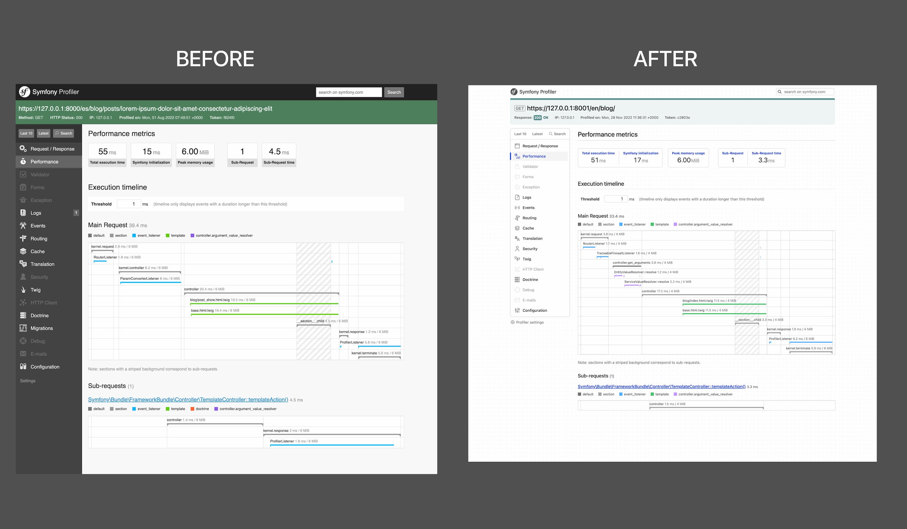
Here's a quick comparison between the old and the new design (in light mode):
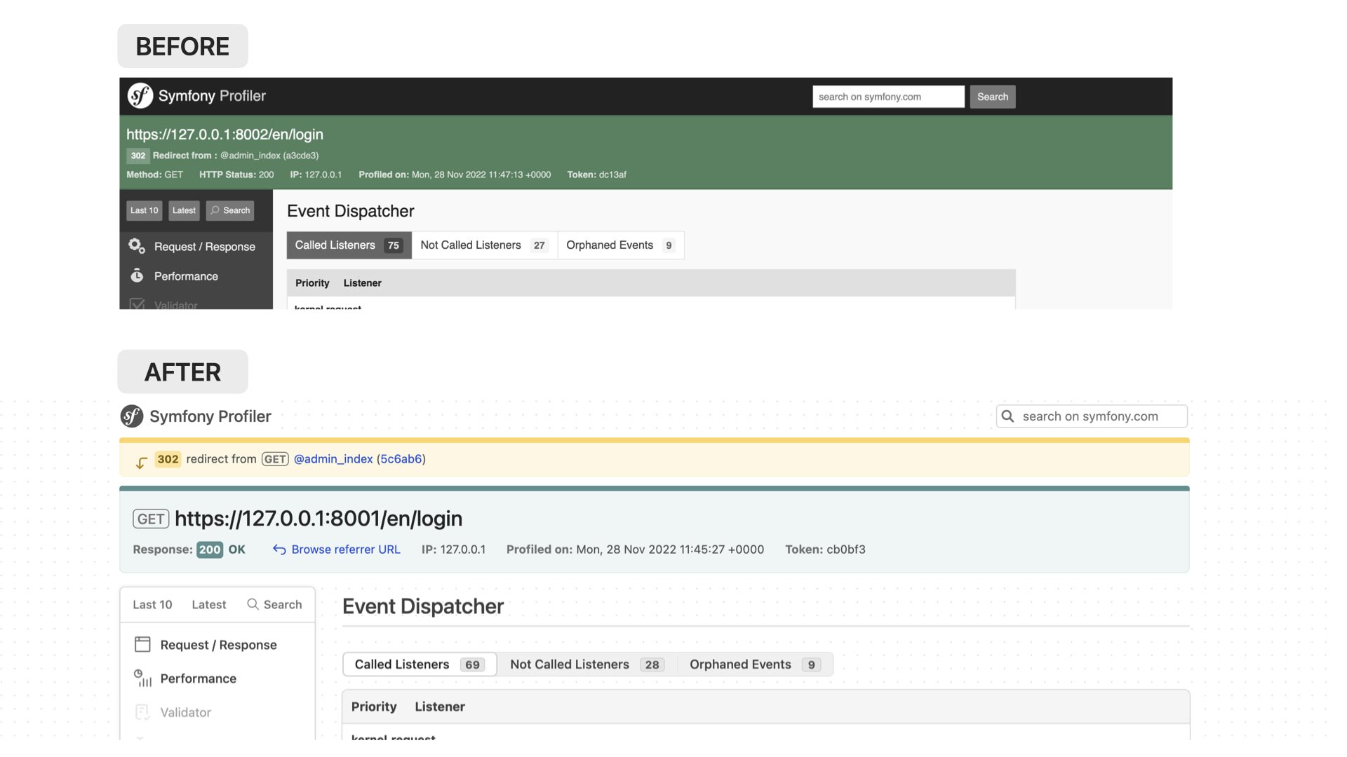
The new design maintains most of the elements of the previous design, but it makes some changes and rearrangements in certain elements. For example, now it's easier to spot if a request originated from a redirect:
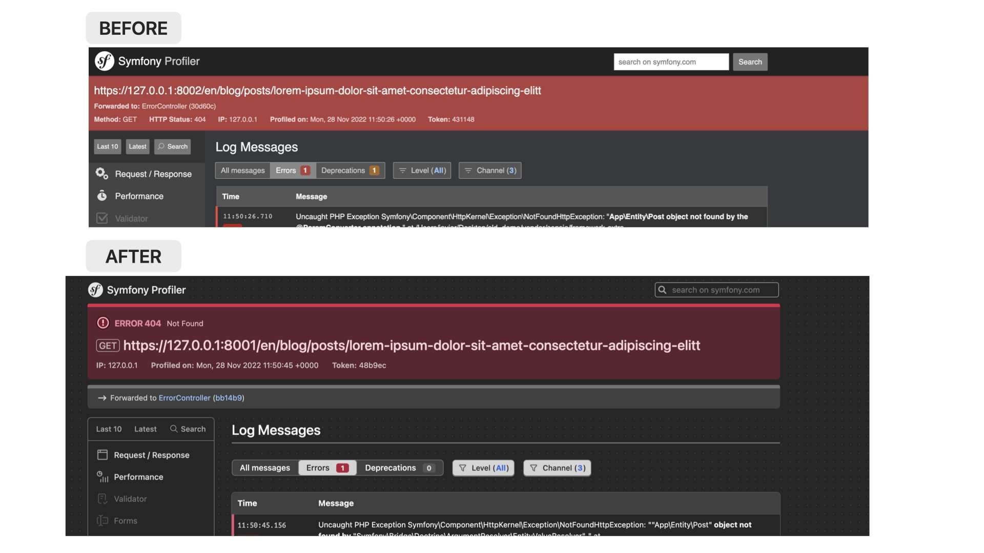
Status codes of error responses are easier to spot too:
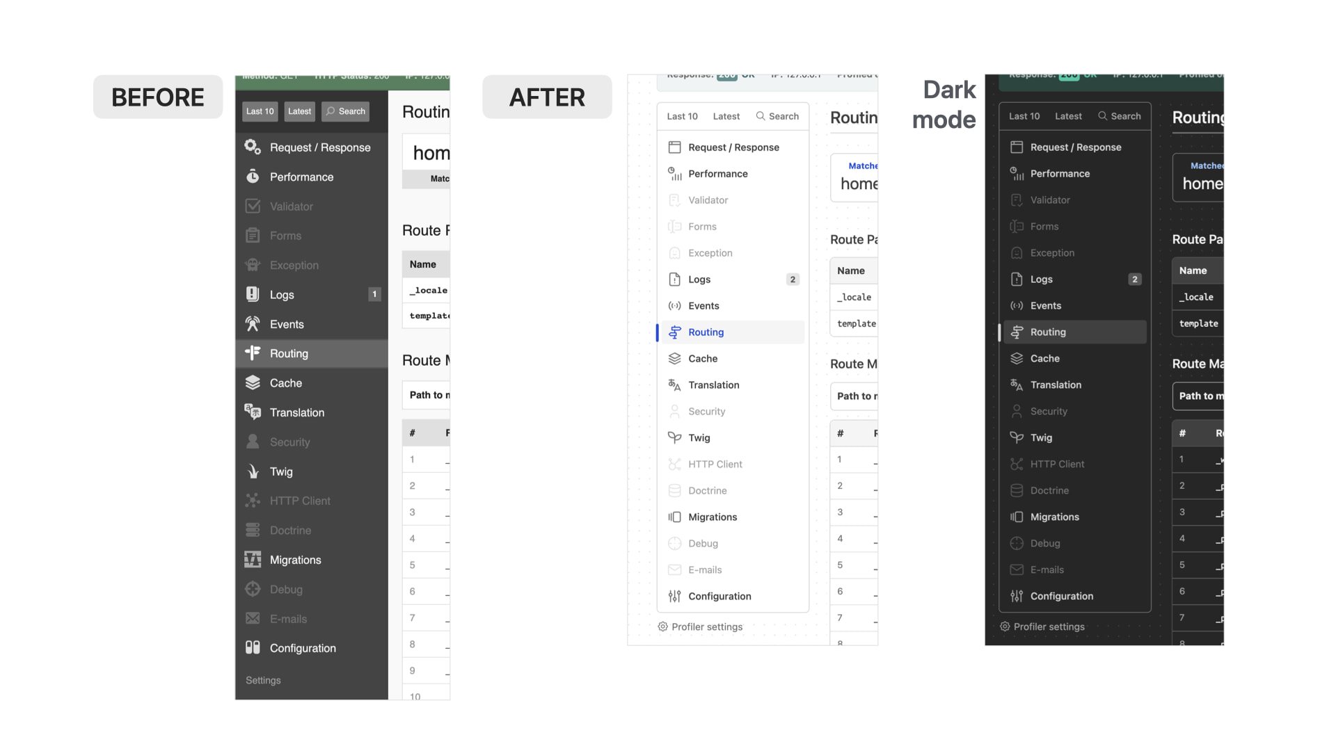
We've also took this opportunity to update the icons used in the profiler. The new icons come from the open source Tabler icons project created by Paweł Kuna:
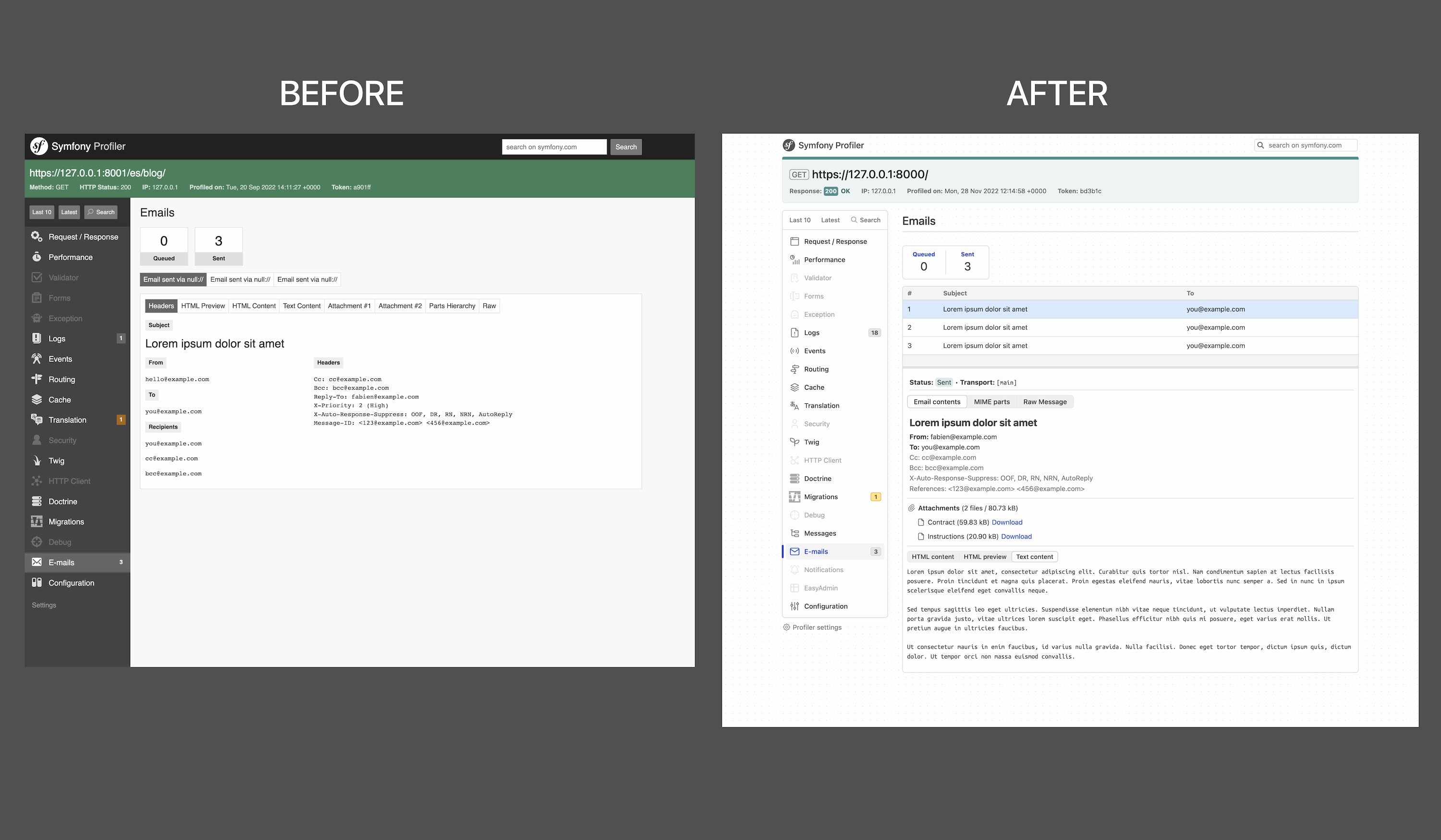
In addition to redesigning elements, we decided to update certain profiler panels to present information in a way that it's easier to debug it. One of the most clear examples is the mailer panel:
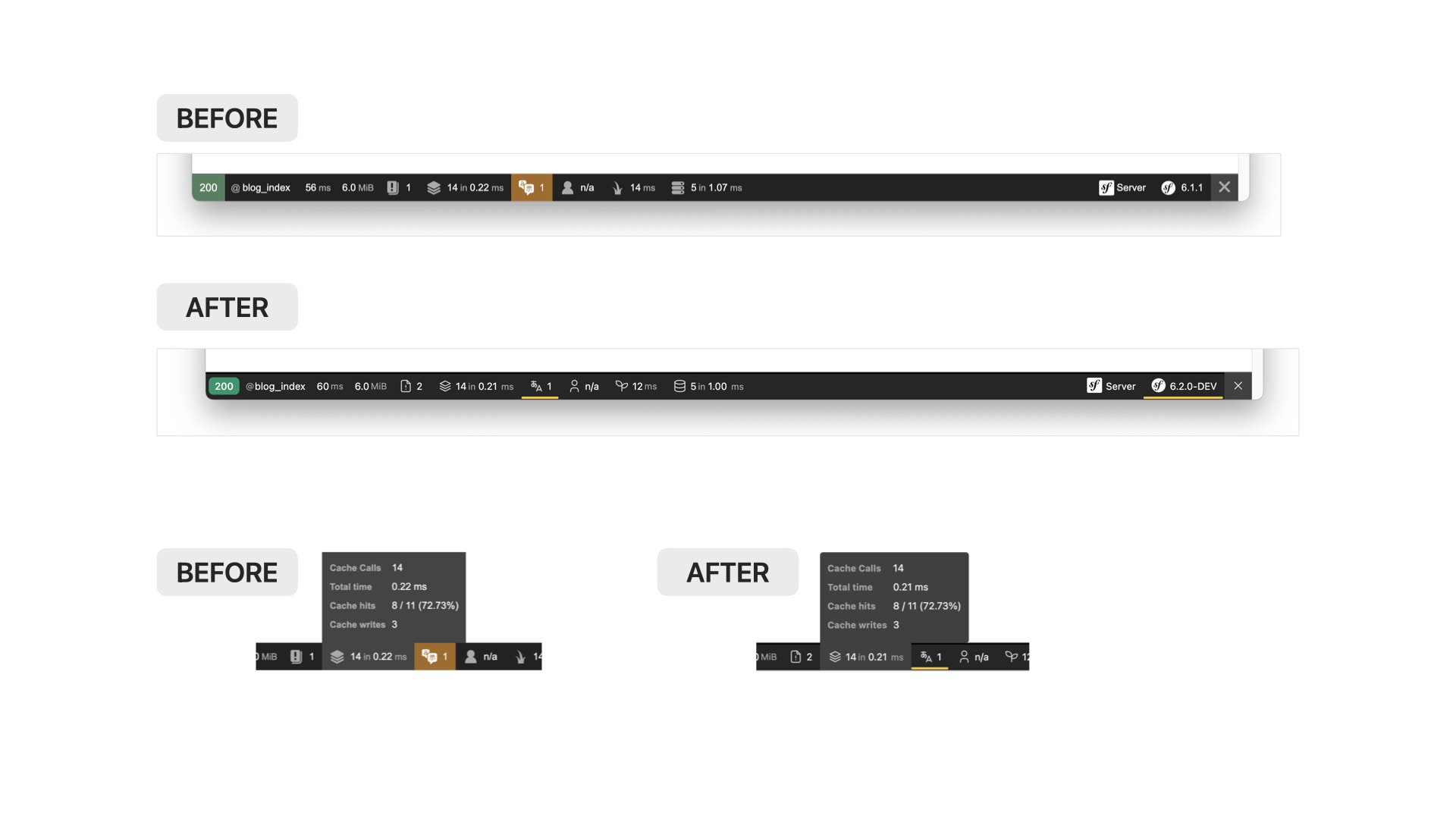
Besides the profiler panels, we've redesigned other features such as the redirect interceptor, the file source code viewer and the debug toolbar. The toolbar redesign summarizes this initiative well: it keeps everything the same, but now it looks more clean and modern:
We could keep showing you many details about the new design, but we prefer that you experience it yourself. Upgrade your projects to Symfony 6.2 and tell us what you think about it.
Great news, it makes the developer experience better :D
Wonderful! 😍
Beautiful! Personally, I prefer the old icons.
Some of the changes are nice but I preferred the higher contrast of the green, red and yellow in the old version. Also in the toolbar a background color is much easier to spot than that tiny little stroke under the text. Also (maybe I'm mistaken here, hard to tell as before and after pictures have different size) it looks like there is much more space around everything so the width of the actual content is much smaller which is bad for smaller screens
@Joshua the best about the new icons is that there are thousands and thousands to choose from, so we can add icons to new features very easily. And third-party bundles can also use icons that match the Symfony Profiler too.
@Tim the width is practically the same. In some panels we've rearranged some contents to make them more compact compared to the previous version. About the web debug toolbar, let's wait to use it in practice before we reevaluate if we should revert that change.
This is so beautifull !
Thanks for the redesign :)
Sorry to see this change, the lack of colour/contrast makes it a lot harder to scan for errors and warnings.