In Symfony 6.3, we've improved the Symfony profiler in different ways. First, we've made an important change that will be invisible for most of you: all links and tabs are now accessible.
Instead of using a custom-made CSS + JS solution, we now use better HTML elements and smarter JavaScript code to build and manage the tabs. We followed the recommendations of the W3C best-practices for accessible tabs.
Another minor but useful change is that all date/times are now presented in your local timezone. The conversion is automatically made via JavaScript when loading any profiler page.
The profiler pages now also use a SVG icon instead of a PNG file. First, this makes the icon look much sharper in all resolutions. Second, this SVG favicon is now dynamic: its color changes depending on the status of the profiled page (black icon for success pages, yellow for redirections and red for errors).
This screenshot shows the original icon (leftmost) and the three new icon colors as rendered by Firefox browser:
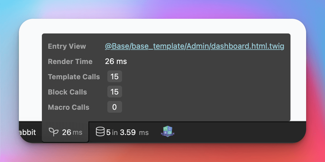
Another nice improvement of Symfony 6.3 profiler is located in the Twig panel. If the application rendered a template while serving the request, you'll now see the "entry view" (the main rendered template) as a clickable link so you can quickly jump into it in your IDE or text editor:

Nice !
Great improvements. Can't wait to try them out.
I love the fast access to the main rendered template. I use a lot the controller link and I missed the same gesture for the template, thanks for the contribution.