Symfony exception pages provide detailed information, such as logs and stack traces, about the errors that happen during the execution of your applications. They are immensely useful, but their design was a bit outdated, specially since we redesigned the toolbar and the profiler in Symfony 2.8.
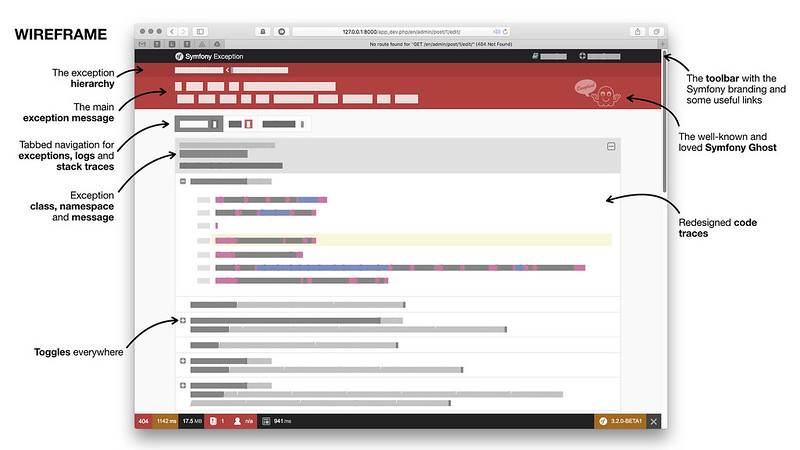
In Symfony 3.3 we decided to redesign the exception pages to keep displaying all the information that you need but with a fresh coat of paint. The new design is based on a big red header with the actionable error message. The rest of the contents (stack traces, logs, etc.) are displayed on tabs:

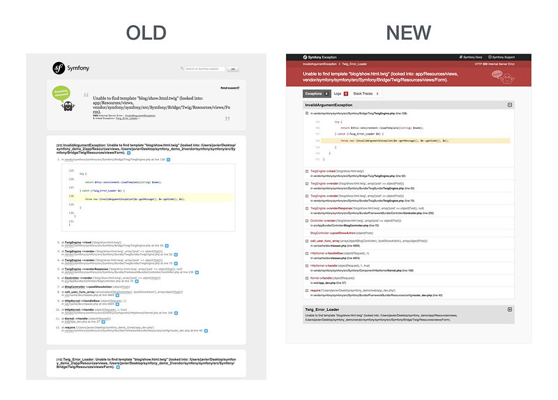
This is a better comparison between the existing and the new design:

The new design is highly dynamic, with toggles everywhere, and little features such as a new favicon to better spot error pages on your browser, a smart code snippet expanding that always tries to expand your own code first instead of Symfony or other vendors code, etc.
This redesign was also the perfect excuse to update our cute exception ghost. In this new design he/she is even happier about your exceptions:

Great work, thanks Javier.
Nice ;) it was useful, now it's useful and beautiful.
Very great vision of the exception page, she was boring ...
Thanks Javier ! The new one is beautiful.
Any thoughts on allowing to see the custom error page in dev mode? E.g. when I work on styling my 404 error page I rather see that instead of the symfony exception page? Maybe a toggle option?
@Florian this may help you: https://symfony.com/doc/current/controller/error_pages.html#testing-error-pages-during-development
Yes! The new version is much more readable. Thank you! :)
This is realy nice. love symfony
Expanding our own code before Symfony code or vendors code is important. Besides, it looks much better. It's great!
Nice!!
Great! <3
I liked the old exception ghost. He was always flipping me off.
"This is Symfony. Here is your exception. Go **** yourself."
Beautiful UX work!
Very good :D i love it
Geeeeeek