Twig Components
Twig components give you the power to bind an object to a template, making it easier to render and reuse small template "units" - like an "alert", markup for a modal, or a category sidebar:
Every component consists of (1) a class:
1
2
3
4
5
6
7
8
9
10
11
// src/Twig/Components/Alert.php
namespace App\Twig\Components;

use Symfony\UX\TwigComponent\Attribute\AsTwigComponent;

#[AsTwigComponent]
class Alert
{
    public string $type = 'success';
    public string $message;
}
And (2) a template:
1
2
3
4
{# templates/components/Alert.html.twig #}
<div class="alert alert-{{ type }}">
    {{ message }}
</div>
Done! Now render it wherever you want:
1
2
3
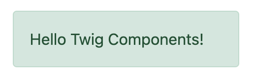
{{ component('Alert', {message: 'Hello Twig Components!'}) }}

<twig:Alert message="Or use the fun HTML syntax!" />
Enjoy your new component!
This brings the familiar "component" system from client-side frameworks into Symfony. Combine this with Live Components, to create an interactive frontend with automatic, Ajax-powered rendering.
Want a demo? Check out https://ux.symfony.com/twig-component#demo
Installation
Let's get this thing installed! Run:
1
$ composer require symfony/ux-twig-componentThat's it! We're ready to go! If you're not using Symfony Flex, add a config file to control the template directory for your components:
1
2
3
4
5
6
# config/packages/twig_component.yaml
twig_component:
    anonymous_template_directory: 'components/'
    defaults:
        # Namespace & directory for components
        App\Twig\Components\: 'components/'
Component Basics
Let's create a reusable "alert" element that we can use to show success
or error messages across our site. Step 1 is to create a component class
and give it the AsTwigComponent attribute:
1
2
3
4
5
6
7
8
9
// src/Twig/Components/Alert.php
namespace App\Twig\Components;

use Symfony\UX\TwigComponent\Attribute\AsTwigComponent;

#[AsTwigComponent]
class Alert
{
}
This class can technically live anywhere, but in practice, you'll put it somewhere under the namespace configured in config/packages/twig_component.yaml. This helps TwigComponent name your component and know where its template lives.
Step 2 is to create the template. By default, templates
live in templates/components/{component_name}.html.twig, where
{component_name} matches the class name of the component:
1
2
3
4
{# templates/components/Alert.html.twig #}
<div class="alert alert-success">
    Success! You've created a Twig component!
</div>
This isn't very interesting yet… since the message is hardcoded in the template. But it's enough! Celebrate by rendering your component from any other Twig template:
1
{{ component('Alert') }}Done! You've just rendered your first Twig Component! You can see it and any other components by running:
1
$ php bin/console debug:twig-componentTake a moment to fist pump - then come back!
Tip
If you use the Symfony MakerBundle, you can easily create a new component
with the make:twig-component command:
1
$ php bin/console make:twig-component AlertNaming Your Component
To give your component a name, TwigComponent looks at the namespace(s)
configured in twig_component.yaml and finds the
first match. If you have the recommended App\Twig\Components\, then:
| Component Class | Component Name |
|---|---|
App\Twig\Components\Alert |
Alert |
App |
Button:Primary |
The : character is used in the name instead of \. See
Configuration for more info.
Instead of letting TwigComponent choose a name, you can also set one yourself:
1
2
3
4
#[AsTwigComponent('alert')]
class Alert
{
}
Passing Data (Props) into your Component
To make our Alert component reusable, we need the message and type
(e.g. success, danger, etc) to be configurable. To do that, create a
public property for each:
1
2
3
4
5
6
7
8
9
10
11
12
// src/Twig/Components/Alert.php
  // ...

  #[AsTwigComponent]
  class Alert
  {
+     public string $message;

+     public string $type = 'success';

      // ...
  }
In the template, the Alert instance is available via
the this variable and public properties are available directly.
Use them to render the two new properties:
1
2
3
4
5
6
<div class="alert alert-{{ type }}">
    {{ message }}

    {# Same as above, but using "this", which is the component object #}
    {{ this.message }}
</div>
How can we populate the message and type properties? By passing
them as "props" via the a 2nd argument to component():
1
2
3
4
5
6
{{ component('Alert', {message: 'Successfully created!'}) }}

{{ component('Alert', {
    type: 'danger',
    message: 'Danger Will Robinson!'
}) }}
Behind the scenes, a new Alert will be instantiated and the
message key (and type if passed) will be set onto the
$message property of the object. Then, the component is rendered! If
a property has a setter method (e.g. setMessage()), that will be
called instead of setting the property directly.
Note
You can disable exposing public properties for a component. When disabled,
this.property must be used:
1
2
3
4
5
#[AsTwigComponent(exposePublicProps: false)]
class Alert
{
    // ...
}
Passing & Rendering Attributes
If you pass extra props that are not settable on your component class, those can be rendered as attributes:
1
2
3
4
{{ component('Alert', {
    id: 'custom-alert-id',
    message: 'Danger Will Robinson!'
}) }}
To render the attributes, use the special attributes variable that's
available in every component template:
1
2
3
<div {{ attributes.defaults({class: 'alert alert-' ~ type}) }}>
    {{ message }}
</div>
See Component Attributes to learn more.
Component Template Path
If you're using the default config, the template
name will be: templates/components/{component_name}.html.twig, where
{component_name} matches the component name.
| Component Name | Template Path |
|---|---|
Alert |
templates/components/Alert.html.twig |
Button:Primary |
templates/components/Button/Primary.html.twig |
Any : in the name are changed to subdirectories.
You can control the template used via the AsTwigComponent attribute:
1
2
3
4
5
6
// src/Twig/Components/Alert.php
  // ...

- #[AsTwigComponent]
+ #[AsTwigComponent(template: 'my/custom/template.html.twig')]
  class Alert
You can also configure the default template directory for an entire namespace. See Configuration.
Component HTML Syntax
So far so good! To make it really nice to work with Twig Components, it comes with an HTML-like syntax where props are passed as attributes:
1
<twig:Alert message="This is really cool!" withCloseButton />This would pass a message and withCloseButton (true) props
to the Alert component and render it! If an attribute is dynamic,
prefix the attribute with : or use the normal {{ }} syntax:
1
2
3
4
5
6
7
<twig:Alert message="hello!" :user="user.id" />

// equal to
<twig:Alert message="hello!" user="{{ user.id }}" />

// pass object, array, or anything you imagine
<twig:Alert :foo="{col: ['foo', 'oof']}" />
Boolean props are converted using PHP's type juggling rules. The
string "false" is converted to the boolean true.
To pass the boolean false, you can pass a Twig expression
{{ false }} or use the dynamic syntax (with the : prefix):
1
2
3
4
5
6
7
8
{# ❌ the string 'false' is converted to the boolean 'true' #}
<twig:Alert message="..." withCloseButton="false" />

{# ✅ use the 'false' boolean value #}
<twig:Alert message="..." withCloseButton="{{ false }}" />

{# ✅ use the dynamic syntax #}
<twig:Alert message="..." :withCloseButton="false" />
Don't forget that you can mix and match props with attributes that you want to render on the root element:
1
<twig:Alert message="hello!" id="custom-alert-id" />To pass an array of attributes, use {{...}} spread operator syntax.
This requires Twig 3.7.0 or higher:
1
<twig:Alert {{ ...myAttributes }} />We'll use the HTML syntax for the rest of the guide.
Passing HTML to Components
Instead of passing a message prop to the Alert component, what if we
could do this?
1
2
3
<twig:Alert>
    I'm writing <strong>HTML</strong> right here!
</twig:Alert>
We can! When you add content between the <twig:Alert> open and
close tag, it's passed to your component template as the block called
content. You can render it like any normal block:
1
2
3
<div {{ attributes.defaults({class: 'alert alert-' ~ type}) }}>
    {% block content %}{% endblock %}
</div>
You can even give the block default content. See Passing HTML to Components via Block for more info.
Using macros in Components
Defining contents inside a component works great, but what if you want to
use a macro inside a component? Good news: you can! But there's a catch:
you cannot import macros using the _self keyword. Instead, you need to
use the full path of the template where the macro is defined:
1
2
3
4
5
6
7
8
9
10
11
12
13
{% macro message_formatter(message) %}
    <strong>{{ message }}</strong>
{% endmacro %}

<twig:Alert>
    {# ❌ this won't work #}
    {% from _self import message_formatter %}

    {# ✅ this works as expected #}
    {% from 'path/of/this/template.html.twig' import message_formatter %}

    {{ message_formatter('...') }}
</twig:Alert>
Dynamic Templates
Sometimes, you need to render a different template based on the component state.
It is possible to reference a component method by passing FromMethod to the template option of AsTwigComponent, which will be used to compute the template to use before rendering the component:
1
2
3
4
5
6
7
8
9
10
11
12
13
14
15
16
17
namespace App\Twig\Components;

use Symfony\UX\TwigComponent\Attribute\AsTwigComponent;
use Symfony\UX\TwigComponent\Attribute\FromMethod;

#[AsTwigComponent(template: new FromMethod('getTemplate'))]
class SearchResults
{
    public string $layout = 'rows';

    public function getTemplate(): string
    {
        return 'rows' === $this->layout
            ? 'components/SearchResults/rows.html.twig'
            : 'components/SearchResults/grid.html.twig';
    }
}
Fetching Services
Let's create a more complex example: a "featured products" component.
You could choose to pass an array of Product objects to the component
and set those on a $products property. But instead, let's let the
component do the work of executing the query.
How? Components are services, which means autowiring works like
normal. This example assumes you have a Product Doctrine entity and
ProductRepository:
1
2
3
4
5
6
7
8
9
10
11
12
13
14
15
16
17
18
19
// src/Twig/Components/FeaturedProducts.php
namespace App\Twig\Components;

use App\Repository\ProductRepository;
use Symfony\UX\TwigComponent\Attribute\AsTwigComponent;

#[AsTwigComponent]
class FeaturedProducts
{
    public function __construct(private ProductRepository $productRepository)
    {
    }

    public function getProducts(): array
    {
        // an example method that returns an array of Products
        return $this->productRepository->findFeatured();
    }
}
In the template, the getProducts() method can be accessed via
this.products:
1
2
3
4
5
6
7
8
{# templates/components/FeaturedProducts.html.twig #}
<div>
    <h3>Featured Products</h3>

    {% for product in this.products %}
        ...
    {% endfor %}
</div>
And because this component doesn't have any public properties that we need to populate, you can render it with:
1
<twig:FeaturedProducts />Note
Because components are services, normal dependency injection can be used.
However, each component service is registered with shared: false. That
means that you can safely render the same component multiple times with
different data because each component will be an independent instance.
Mounting Data
Most of the time, you will create public properties and pass values to them as "props" when rendering the component. However, there are several hooks available when you need to perform more complex logic.
The mount() Method
The mount() method gives you more control over how your "props" are handled.
It is called once, immediately after the component is instantiated, but before
the component system assigns the props you passed when rendering.
For example, if you call your component like this:
1
<twig:Alert type="error" message="..."/>The following code won't work as expected:
1
2
3
4
5
6
7
8
9
10
11
12
13
14
15
16
17
18
19
20
// src/Twig/Components/Alert.php
// ...

#[AsTwigComponent]
class Alert
{
    public string $message;
    public string $type = 'success';

    public function mount(): void
    {
        // ❌ this won't work: at this point $type still has its default value.
        // Passed values are not yet available in props.
        if ('error' === $this->type) {
            // ...
        }
    }

    // ...
}
Inside mount(), each prop has only its default value (or null if it is
untyped and has no default). If you need a prop's value, declare a parameter in
mount() whose name matches the prop instead of reading the public property:
1
2
3
4
5
6
7
8
public function mount(string $type): void
{
    // ✅ this works as expected: the $type argument in PHP has the value
    // passed to the 'type' prop in the Twig template
    if ('error' === $type) {
        // ...
    }
}
If a prop name (e.g. type) matches an argument name in mount(),
its value will be passed only to the method. The component system will not
set it on a public property or use it in the component's attributes.
mount() can also receive props even when no matching public property
exists. For example, pass an isError prop instead of type:
1
<twig:Alert isError="{{ true }}" message="..."/>Define a $isError argument to capture the prop and initialize other
properties using that value:
1
2
3
4
5
6
7
8
9
10
11
12
13
14
15
#[AsTwigComponent]
class Alert
{
    public string $message;
    public string $type = 'success';

    public function mount(bool $isError = false): void
    {
        if ($isError) {
            $this->type = 'danger';
        }
    }

    // ...
}
PreMount Hook
If you need to modify/validate data before it's mounted on the
component use a PreMount hook:
1
2
3
4
5
6
7
8
9
10
11
12
13
14
15
16
17
18
19
20
21
22
23
24
25
26
27
28
// src/Twig/Components/Alert.php
use Symfony\Component\OptionsResolver\OptionsResolver;
use Symfony\UX\TwigComponent\Attribute\PreMount;
// ...

#[AsTwigComponent]
class Alert
{
    public string $message;
    public string $type = 'success';

    #[PreMount]
    public function preMount(array $data): array
    {
        // validate data
        $resolver = new OptionsResolver();
        $resolver->setIgnoreUndefined(true);

        $resolver->setDefaults(['type' => 'success']);
        $resolver->setAllowedValues('type', ['success', 'danger']);
        $resolver->setRequired('message');
        $resolver->setAllowedTypes('message', 'string');

        return $resolver->resolve($data) + $data;
    }

    // ...
}
Note
In its default configuration, the OptionsResolver treats all props.
However, if more props are passed than the options defined in the OptionsResolver,
an error will be prompted, indicating that one or more options do not exist.
To avoid this, use the ignoreUndefined() method with true.
See ignore not defined options for more info:
1
$resolver->setIgnoreUndefined(true);The major drawback of this configuration is that the OptionsResolver will remove every non-defined option when resolving data. To maintain props that have not been defined within the OptionsResolver, combine the data from the hook with the resolved data:
1
return $resolver->resolve($data) + $data;The data returned from preMount() will be used as the props for mounting.
Note
If your component has multiple PreMount hooks, and you'd like to control
the order in which they're called, use the priority attribute parameter:
PreMount(priority: 10) (higher called earlier).
PostMount Hook
After a component is instantiated and its data mounted, you can run extra
code via the PostMount hook:
1
2
3
4
5
6
7
8
9
10
11
12
13
14
15
16
// src/Twig/Components/Alert.php
use Symfony\UX\TwigComponent\Attribute\PostMount;
// ...

#[AsTwigComponent]
class Alert
{
    #[PostMount]
    public function postMount(): void
    {
        if (str_contains($this->message, 'danger')) {
            $this->type = 'danger';
        }
    }
    // ...
}
A PostMount method can also receive an array $data argument, which
will contain any props passed to the component that have not yet been processed,
(i.e. they don't correspond to any property and weren't an argument to the
mount() method). You can handle these props, remove them from the $data
and return the array:
1
2
3
4
5
6
7
8
9
10
11
12
13
14
15
16
17
18
19
20
21
22
23
24
// src/Twig/Components/Alert.php
#[AsTwigComponent]
class Alert
{
    public string $message;
    public string $type = 'success';

    #[PostMount]
    public function processAutoChooseType(array $data): array
    {
        if ($data['autoChooseType'] ?? false) {
            if (str_contains($this->message, 'danger')) {
                $this->type = 'danger';
            }

            // remove the autoChooseType prop from the data array
            unset($data['autoChooseType']);
        }

        // any remaining data will become attributes on the component
        return $data;
    }
    // ...
}
Note
If your component has multiple PostMount hooks, and you'd like to control
the order in which they're called, use the priority attribute parameter:
PostMount(priority: 10) (higher called earlier).
Anonymous Components
Sometimes a component is simple enough that it doesn't need a PHP class. In this case, you can skip the class and only create the template. The component name is determined by the location of the template:
1
2
3
4
{# templates/components/Button/Primary.html.twig #}
<button {{ attributes.defaults({class: 'primary'}) }}>
    {% block content %}{% endblock %}
</button>
The name for this component will be Button:Primary because of
the subdirectory:
1
2
3
4
5
6
7
8
{# index.html.twig #}
...
<div>
   <twig:Button:Primary>Click Me!</twig:Button:Primary>
</div>

{# renders as: #}
<button class="primary">Click Me!</button>
If your anonymous component lives in a directory with the same name, you can
name the component file index.html.twig to avoid repetition:
1
2
3
4
5
6
{# templates/components/Menu/index.html.twig #}
<nav {{ attributes.defaults({class: 'menu'}) }}>
    <ul>
        {% block content %}{% endblock %}
    </ul>
</nav>
1 2 3 4 5
{# templates/components/Menu/Item.html.twig #}
{% props href, label %}
<li {{ attributes.defaults({class: 'menu__item'}) }}>
<a href="{{ href }}">{% block content %}{{ label }}{% endblock %}</a>
</li>1 2 3 4 5 6 7 8 9 10 11 12 13 14
{# index.html.twig #}
...
<twig:Menu>
<twig:Menu:Item href="/">Home</twig:Menu:Item>
<twig:Menu:Item href="/about">About</twig:Menu:Item>
</twig:Menu>
{# renders as: #}
<nav class="menu">
<ul>
<li class="menu__item"><a href="/">Home</a></li>
<li class="menu__item"><a href="/about">About</a></li>
</ul>
</nav>Like normal, you can pass extra attributes that will be rendered on the element:
1 2 3 4 5 6 7 8
{# index.html.twig #}
...
<div>
<twig:Button:Primary type="button" name="foo">Click Me!</twig:Button:Primary>
</div>
{# renders as: #}
<button class="primary" type="button" name="foo">Click Me!</button>You can also pass a variable (prop) into your template:
1 2 3 4 5
{# index.html.twig #}
...
<div>
<twig:Button icon="fa-plus" type="primary" role="button">Click Me!</twig:Button>
</div>To tell the system that icon and type are props and not attributes, use the
{% props %} tag at the top of your template. Props are required by default, but
it is possible to set a default value with =:
1 2 3 4 5 6 7 8 9 10
{# templates/components/Button.html.twig #}
{# prop "icon" is required, but prop "type" has a default value to "primary" #}
{% props icon, type = 'primary' %}
<button {{ attributes.defaults({class: 'btn btn-'~type}) }}>
{% block content %}{% endblock %}
{% if icon %}
<span class="fa-solid fa-{{ icon }}"></span>
{% endif %}
</button>Examples of usage:
1 2 3 4 5 6 7 8
{# property "icon" is missing, an exception is thrown #}
<twig:Button>Share</twig:Button>
{# property "icon" is passed, property "type" use its default value "primary" #}
<twig:Button icon="share">Share</twig:Button>
{# both properties "icon" and "type" are passed #}
<twig:Button icon="share" type="secondary">Share</twig:Button>Passing HTML to Components Via Blocks
Props aren't the only way you can pass something to your component. You can also pass content:
1 2 3
<twig:Alert type="success">
<div>Congratulations! You've won a free puppy!</div>
</twig:Alert>In your component template, this becomes a block named content:
1 2 3 4 5
<div class="alert alert-{{ type }}">
{% block content %}
// the content will appear in here
{% endblock %}
</div>You can also add more, named blocks:
1 2 3 4 5 6
<div class="alert alert-{{ type }}">
{% block content %}{% endblock %}
{% block footer %}
<div>Default Footer content</div>
{% endblock %}
</div>Render these in the normal way.
1 2 3 4 5 6 7 8
<twig:Alert type="success">
<div>Congrats on winning a free puppy!</div>
<twig:block name="footer">
{{ parent() }} {# render the default content if needed #}
<button class="btn btn-primary">Claim your prize</button>
</twig:block>
</twig:Alert>Passing content into your template can also be done with LiveComponents though there are some caveats to know related to variable scope. See Passing Blocks to Live Components.
There is also a non-HTML syntax that can be used:
1 2 3 4
{% component Alert with {type: 'success'} %}
{% block content %}<div>Congrats!</div>{% endblock %}
{% block footer %}... footer content{% endblock %}
{% endcomponent %}Context / Variables Inside of Blocks
The content inside of the <twig:Component> should be viewed as living in its own,
independent template, which extends the component's template. This has a few interesting
consequences.
First, inside of <twig:Component>, the this variable represents
the component you're now rendering and you have access to all of that
component's variables:
1 2 3 4 5 6 7 8
{# templates/components/SuccessAlert.html.twig #}
{{ this.someFunction }} {# this === SuccessAlert #}
<twig:Alert type="success">
{{ this.someFunction }} {# this === Alert #}
{{ type }} {# references a "type" prop from Alert #}
</twig:Alert>Conveniently, in addition to the variables from the Alert component, you
also have access to whatever variables are available in the original template:
1 2 3 4 5
{# templates/components/SuccessAlert.html.twig #}
{% set name = 'Fabien' %}
<twig:Alert type="success">
Hello {{ name }}
</twig:Alert>ALL variables from the upper component (e.g. SuccessAlert) are available
inside the content of the lower component (e.g. Alert). However, because variables
are merged, any variables with the same name are overridden by the lower component
(e.g. Alert). That's why this refers to the embedded, or "current" component
Alert.
There is also one special superpower when passing content to a component: your code executes as if it is "copy-and-pasted" into the block of the target template. This means you can access variables from the block you're overriding! For example:
1 2 3 4 5 6
{# templates/component/SuccessAlert.html.twig #}
{% for message in messages %}
{% block alert_message %}
A default {{ message }}
{% endblock %}
{% endfor %}When overriding the alert_message block, you have access to the message variable:
1 2 3 4 5 6
{# templates/some_page.html.twig #}
<twig:SuccessAlert>
<twig:block name="alert_message">
I can override the alert_message block and access the {{ message }} too!
</twig:block>
</twig:SuccessAlert>As mentioned before, variables from lower components are merged with those from
upper components. When you need access to some properties or functions from higher
components, that can be done via the outerScope... variable:
1 2 3 4 5 6 7 8 9 10 11 12
{# templates/SuccessAlert.html.twig #}
{% set name = 'Fabien' %}
{% set message = 'Hello' %}
{% component Alert with {type: 'success', name: 'Bart'} %}
Hello {{ name }} {# Hello Bart #}
{{ message }} {{ outerScope.name }} {# Hello Fabien #}
{{ outerScope.this.someFunction }} {# this refers to SuccessAlert #}
{{ outerScope.this.someProp }} {# references a "someProp" prop from SuccessAlert #}
{% endcomponent %}You can keep referring to components higher up as well. Just add another outerScope.
Remember though that the outerScope reference only starts once you're INSIDE the (embedded) component.
1 2 3 4 5 6 7 8 9 10 11
{# templates/FancyProfileCard.html.twig #}
{% component Card %}
{% block header %}
{% component Alert with {message: outerScope.this.someProp} %} {# not yet INSIDE the Alert template #}
{% block content %}
{{ message }} {# same value as below, indirectly refers to FancyProfileCard::someProp #}
{{ outerScope.outerScope.this.someProp }} {# directly refers to FancyProfileCard::someProp #}
{% endblock %}
{% endcomponent %}
{% endblock %}
{% endcomponent %}Inheritance & Forwarding "Outer Blocks"
The content inside a <twig: component tag should be viewed as living in
its own, independent template, which extends the component's template. This means that
any blocks that live in the "outer" template are not available. However, you
can access these via a special outerBlocks variable:
1 2 3 4 5 6 7 8 9 10 11 12 13
{% extends 'base.html.twig' %}
{% block call_to_action %}<strong>Attention! Free Puppies!</strong>{% endblock %}
{% block body %}
<twig:Alert>
{# this would NOT work... #}
{{ block('call_to_action') }}
{# ...but this works! #}
{{ block(outerBlocks.call_to_action) }}
</twig:Alert>
{% endblock %}The outerBlocks variable becomes especially useful with nested components.
For example, imagine we want to create a SuccessAlert component:
1 2 3 4
{# templates/some_page.html.twig #}
<twig:SuccessAlert>
We will successfully <em>forward</em> this block content!
<twig:SuccessAlert>We already have a generic Alert component, so let's reuse it:
1 2 3 4
{# templates/components/Alert.html.twig #}
<div {{ attributes.defaults({class: 'alert alert-'~type}) }}">
{% block content %}{% endblock %}
</div>To do this, the SuccessAlert component can grab the content block
that's passed to it via the outerBlocks variable and forward it into Alert:
1 2 3 4
{# templates/components/SuccessAlert.html.twig #}
<twig:Alert type="success">
{{ block(outerBlocks.content) }}
</twig:Alert>By passing the original content block into the content block of Alert,
this will work perfectly.
Component Attributes
A common need for components is to configure/render attributes for the
root node. Attributes are any props that are passed when rendering that
cannot be mounted on the component itself. This extra data is added to a
ComponentAttributes object that's available as attributes in your
component's template:
1 2 3 4
{# templates/components/MyComponent.html.twig #}
<div {{ attributes }}>
My Component!
</div>When rendering the component, you can pass an array of html attributes to add:
1 2 3 4 5 6
<twig:MyComponent class="foo" style="color: red" />
{# renders as: #}
<div class="foo" style="color:red">
My Component!
</div>Set an attribute's value to true to render just the attribute name:
1 2 3 4 5 6 7 8
{# templates/components/Input.html.twig #}
<input {{ attributes }}/>
{# render component #}
<twig:Input type="text" value="" :autofocus="true" />
{# renders as: #}
<input type="text" value="" autofocus/>Set an attribute's value to false to exclude the attribute:
1 2 3 4 5 6 7 8
{# templates/components/Input.html.twig #}
<input {{ attributes }}/>
{# render component #}
<twig:Input type="text" value="" :autofocus="false" />
{# renders as: #}
<input type="text" value=""/>To add a custom Stimulus controller to your root component element:
1
<div {{ attributes.defaults(stimulus_controller('my-controller', {someValue: 'foo'})) }}>Note
The stimulus_controller() function requires symfony/stimulus-bundle.
1
$ composer require symfony/stimulus-bundleNote
You can adjust the attributes variable exposed in your template:
1 2 3 4 5
#[AsTwigComponent(attributesVar: '_attributes')]
class Alert
{
// ...
}Defaults & Merging
In your component template, you can set defaults that are merged with
passed attributes. The passed attributes override the default with
the exception of class. For class, the defaults are prepended:
1
2
3
4
5
6
7
8
9
10
11
12
13
14
{# templates/components/MyComponent.html.twig #}
<button {{ attributes.defaults({class: 'bar', type: 'button'}) }}>Save</button>
{# render component #}
{{ component('MyComponent', {style: 'color:red'}) }}
{# renders as: #}
<button class="bar" type="button" style="color:red">Save</button>
{# render component #}
{{ component('MyComponent', {class: 'foo', type: 'submit'}) }}
{# renders as: #}
<button class="bar foo" type="submit">Save</button>Render
You can take full control over the attributes that are rendered by using the
render() method.
1 2 3 4 5 6 7 8 9 10 11 12 13 14 15
{# templates/components/MyComponent.html.twig #}
<div
style="{{ attributes.render('style') }} display:block;"
{{ attributes }} {# be sure to always render the remaining attributes! #}
>
My Component!
</div>
{# render component #}
{{ component('MyComponent', {style: 'color:red;'}) }}
{# renders as: #}
<div style="color:red; display:block;">
My Component!
</div>Caution
There are a few important things to know about using render():
You need to be sure to call your
render()methods before calling{{ attributes }}or some attributes could be rendered twice. For instance:1 2 3 4 5 6 7 8 9 10 11 12 13 14 15
{# templates/components/MyComponent.html.twig #} <div {{ attributes }} {# called before style is rendered #} style="{{ attributes.render('style') }} display:block;" > My Component! </div> {# render component #} {{ component('MyComponent', {style: 'color:red;'}) }} {# renders as: #} <div style="color:red;" style="color:red; display:block;"> {# style is rendered twice! #} My Component! </div>If you add an attribute without calling
render(), it will be rendered twice. For instance:1 2 3 4 5 6 7 8 9 10 11 12 13 14 15
{# templates/components/MyComponent.html.twig #} <div style="display:block;" {# not calling attributes.render('style') #} {{ attributes }} > My Component! </div> {# render component #} {{ component('MyComponent', {style: 'color:red;'}) }} {# renders as: #} <div style="display:block;" style="color:red;"> {# style is rendered twice! #} My Component! </div>
Only
Extract specific attributes and discard the rest:
1 2 3 4 5 6 7 8 9 10 11 12
{# render component #}
{{ component('MyComponent', {class: 'foo', style: 'color:red'}) }}
{# templates/components/MyComponent.html.twig #}
<div {{ attributes.only('class') }}>
My Component!
</div>
{# renders as: #}
<div class="foo">
My Component!
</div>Without
Exclude specific attributes:
1 2 3 4 5 6 7 8 9 10 11 12
{# render component #}
{{ component('MyComponent', {class: 'foo', style: 'color:red'}) }}
{# templates/components/MyComponent.html.twig #}
<div {{ attributes.without('class') }}>
My Component!
</div>
{# renders as: #}
<div style="color:red">
My Component!
</div>Nested Attributes
You can have attributes that aren't meant to be used on the root element but one of its descendants. This is useful for, say, a dialog component where you want to allow customizing the attributes of the dialog's content, title, and footer. Here's an example of this:
1 2 3 4 5 6 7 8 9 10 11 12 13 14 15 16 17 18 19 20 21 22 23 24 25 26 27 28 29 30
{# templates/components/Dialog.html.twig #}
<div {{ attributes }}>
<div {{ attributes.nested('title') }}>
{% block title %}Default Title{% endblock %}
</div>
<div {{ attributes.nested('body') }}>
{% block content %}{% endblock %}
</div>
<div {{ attributes.nested('footer') }}>
{% block footer %}Default Footer{% endblock %}
</div>
</div>
{# render #}
<twig:Dialog class="foo" title:class="bar" body:class="baz" footer:class="qux">
Some content
</twig:MyDialog>
{# output #}
<div class="foo">
<div class="bar">
Default Title
</div>
<div class="baz">
Some content
</div>
<div class="qux">
Default Footer
</div>
</div>The nesting is recursive so you could potentially do something like this:
1 2 3 4 5 6 7
<twig:Form
:form="form"
class="ui-form"
row:class="ui-form-row"
row:label:class="ui-form-label"
row:widget:class="ui-form-widget"
/>Class Variant Authority
CVA (Class Variant Authority) originates from the JavaScript ecosystem.
It enables reusable, customizable components by managing variants (e.g., color, size).
The html_cva() Twig function from twig/html-extra:^3.12 defines base classes (always applied)
and variant-specific classes:
1 2 3 4 5 6 7 8 9 10 11 12
{% set button = html_cva(
base: 'btn',
variants: {
color: { primary: 'btn-primary', secondary: 'btn-secondary' },
size: { sm: 'btn-sm', md: 'btn-md', lg: 'btn-lg' }
},
default_variant: { color: 'primary', size: 'md' }
) %}
<button class="{{ button.apply({color, size}, attributes.render('class')) }}">
{% block content %}{% endblock %}
</button>When rendering the component, pass the desired variants:
1 2 3 4 5 6 7 8
{# renders as: <button class="btn btn-primary btn-md">... #}
<twig:Button>Click Me!</twig:Button>
{# renders as: <button class="btn btn-secondary btn-lg">... #}
<twig:Button color="secondary" size="lg">Click Me!</twig:Button>
{# renders as: <button class="btn btn-primary btn-sm custom-class">... #}
<twig:Button size="sm" class="custom-class">Click Me!</twig:Button>CVA and Tailwind CSS
CVA integrates seamlessly with Tailwind CSS, though class conflicts may occur.
Use the tailwind_merge() function from tales-from-a-dev/twig-tailwind-extra
to resolve conflicts:
1 2 3
<div class="{{ button.apply({color, size}, attributes.render('class'))|tailwind_merge }}">
{% block content %}{% endblock %}
</div>Sharing State With provide / inject
When a component is made of several pieces, descendants often need values
declared on the root. Forwarding those values through every level as props
gets tedious fast. Use provide() in the parent to publish a value, and
inject() in any descendant to read it.
In the parent, publish values with provide():
1
2
3
4
5
6
7
8
{# templates/components/InputOtp.html.twig #}
{% props maxLength = 6 %}
{% do provide('inputOtp.maxLength', maxLength) %}
<div class="input-otp">
{% block content %}{% endblock %}
</div>In any descendant (at any depth), read them with inject()`:
1 2 3 4 5 6 7
{# templates/components/InputOtp/Slot.html.twig #}
{% props input %}
{# Fallback to 4 if the parent doesn't provide a value for some reason #}
{% set maxLength = inject('inputOtp.maxLength', 4) %}
<input type="text" maxlength="1" data-index="{{ input }}" data-max-length="{{ maxLength }}" />Here, Slot reads maxLength from InputOtp even though Group
sits in between and does not forward anything:
1 2 3 4 5 6 7
<twig:InputOtp maxLength="6">
<twig:InputOtp:Group>
{% for i in 0..5 %}
<twig:InputOtp:Slot input="{{ i + 1 }}" />
{% endfor %}
</twig:InputOtp:Group>
</twig:InputOtp>Keys are arbitrary strings; values can be any type, including null.
Prefix keys with the component name ('inputOtp.maxLength',
'tabs.active') to avoid collisions across unrelated components.
Rules:
- Values flow top-down only. A child cannot push values back up.
inject()walks ancestors nearest-first, and skips the current component. Read your own state through local variables.- Once a parent finishes rendering, its provides are dropped. Sibling components never share state.
- Calling
provide()outside a component template throws.
Warning
provide() runs at render time. A descendant only sees a value if
the corresponding provide() call executed first. Place
provide() at the top of the parent template, before
{% block content %}. If the same key is provided twice, the last
call wins.
This complements outerScope, which only exposes the immediate parent's local context.
Higher-Order Components (Component Wrappers)
You can create a component that wraps another component to add additional markup, behavior, or structure. This is useful when you want to extend a base component without modifying it.
This type of component is sometimes called a "Higher-Order Component" (HOC) or a "Component Wrapper".
For example, create a base Modal component:
1 2 3 4 5 6
{# templates/components/Modal.html.twig #}
<div{{ attributes.defaults({class: 'modal'}) }}>
<div class="modal-content">
{% block content %}{% endblock %}
</div>
</div>Then create a Modal:Confirm component that wraps it and adds confirmation buttons:
1 2 3 4 5 6 7 8 9 10 11
{# templates/components/Modal/Confirm.html.twig #}
{% props confirmText = 'Confirm', cancelText = 'Cancel' %}
<twig:Modal {{ ...attributes.defaults({class: 'modal-confirm'}) }}>
{{ block(outerBlocks.content) }}
<div class="modal-actions">
<button type="button" class="btn-secondary">{{ cancelText }}</button>
<button type="submit" class="btn-primary">{{ confirmText }}</button>
</div>
</twig:Modal>Usage:
1 2 3 4 5 6 7
<twig:Modal:Confirm>
Are you sure you want to delete this item?
</twig:Modal:Confirm>
<twig:Modal:Confirm confirmText="Yes, delete it" data-controller="modal">
This action cannot be undone.
</twig:Modal:Confirm>The key parts are:
- Spread operator
{{ ...attributes }}- passes attributes to the wrapped component outerBlocks- forwards content blocks from the wrapper to the wrapped component- The wrapper can add its own props (
confirmText,cancelText) and markup
Test Helpers
You can test how your component is mounted and rendered using the
InteractsWithTwigComponents trait:
1 2 3 4 5 6 7 8 9 10 11 12 13 14 15 16 17 18 19 20 21 22 23 24 25 26 27 28 29 30 31 32 33 34 35 36 37 38 39 40 41 42 43 44 45 46
use Symfony\Bundle\FrameworkBundle\Test\KernelTestCase;
use Symfony\UX\TwigComponent\Test\InteractsWithTwigComponents;
class MyComponentTest extends KernelTestCase
{
use InteractsWithTwigComponents;
public function testComponentMount(): void
{
$component = $this->mountTwigComponent(
name: 'MyComponent', // can also use FQCN (MyComponent::class)
data: ['foo' => 'bar'],
);
$this->assertInstanceOf(MyComponent::class, $component);
$this->assertSame('bar', $component->foo);
}
public function testComponentRenders(): void
{
$rendered = $this->renderTwigComponent(
name: 'MyComponent', // can also use FQCN (MyComponent::class)
data: ['foo' => 'bar'],
);
$this->assertStringContainsString('bar', (string) $rendered);
// use the crawler
$this->assertCount(5, $rendered->crawler()->filter('ul li'));
}
public function testEmbeddedComponentRenders(): void
{
$rendered = $this->renderTwigComponent(
name: 'MyComponent', // can also use FQCN (MyComponent::class)
data: ['foo' => 'bar'],
content: '<div>My content</div>', // "content" (default) block
blocks: [
'header' => '<div>My header</div>',
'menu' => $this->renderTwigComponent('Menu'), // can embed other components
],
);
$this->assertStringContainsString('bar', (string) $rendered);
}
}Note
The InteractsWithTwigComponents trait can only be used in tests that extend
Symfony.
Special Component Variables
By default, your template will have access to the following variables:
thisattributes- ... and all public properties on your component
There are also a few other special ways you can control the variables.
ExposeInTemplate Attribute
All public component properties are available directly in your component
template. You can use the ExposeInTemplate attribute to expose
private/protected properties and public methods directly in a component
template (someProp vs this.someProp, someMethod vs this.someMethod).
Properties must be accessible (have a getter). Methods cannot have
required parameters:
1 2 3 4 5 6 7 8 9 10 11 12 13 14 15 16 17 18 19 20 21 22 23 24 25 26 27 28 29 30 31 32 33 34 35 36 37 38 39 40 41 42 43 44 45 46 47 48 49 50 51 52 53
// ...
use Symfony\UX\TwigComponent\Attribute\ExposeInTemplate;
#[AsTwigComponent]
class Alert
{
#[ExposeInTemplate]
private string $message; // available as `{{ message }}` in the template
#[ExposeInTemplate('alert_type')]
private string $type = 'success'; // available as `{{ alert_type }}` in the template
#[ExposeInTemplate(name: 'ico', getter: 'fetchIcon')]
private string $icon = 'ico-warning'; // available as `{{ ico }}` in the template using `fetchIcon()` as the getter
/**
* Required to access $this->message
*/
public function getMessage(): string
{
return $this->message;
}
/**
* Required to access $this->type
*/
public function getType(): string
{
return $this->type;
}
/**
* Required to access $this->icon
*/
public function fetchIcon(): string
{
return $this->icon;
}
#[ExposeInTemplate]
public function getActions(): array // available as `{{ actions }}` in the template
{
// ...
}
#[ExposeInTemplate('dismissable')]
public function canBeDismissed(): bool // available as `{{ dismissable }}` in the template
{
// ...
}
// ...
}Note
When using ExposeInTemplate on a method the value is fetched eagerly
before rendering.
Computed Properties
In the previous example, instead of querying for the featured products
immediately (e.g. in __construct()), we created a getProducts()
method and called that from the template via this.products.
This was done because, as a general rule, you should make your
components as lazy as possible and store only the information you need
on its properties (this also helps if you convert your component to a
live component later). With this setup, the query is only executed if and
when the getProducts() method is actually called. This is very similar
to the idea of "computed properties" in frameworks like Vue.
But there's no magic with the getProducts() method: if you call
this.products multiple times in your template, the query would be
executed multiple times.
To make your getProducts() method act like a true computed property,
call computed.products in your template. computed is a proxy
that wraps your component and caches the return of methods. If they
are called additional times, the cached value is used.
1 2 3 4 5 6 7 8 9 10 11 12 13
{# templates/components/FeaturedProducts.html.twig #}
<div>
<h3>Featured Products</h3>
{% for product in computed.products %}
...
{% endfor %}
...
{% for product in computed.products %} {# use cache, does not result in a second query #}
...
{% endfor %}
</div>Note
Computed methods only work for component methods with no required arguments.
Tip
Ensure to not use the ExposeInTemplate attribute on a computed method,
otherwise the method will be called twice instead of only once, leading to
unnecessary overhead and potential performance issues.
Events
Twig Components dispatches various events throughout the lifecycle of instantiating, mounting and rendering a component.
PreRenderEvent
Subscribing to the PreRenderEvent gives the ability to modify
the twig template and twig variables before components are rendered:
1 2 3 4 5 6 7 8 9 10 11 12 13 14 15 16 17 18 19 20 21 22 23 24 25
use Symfony\Component\EventDispatcher\EventSubscriberInterface;
use Symfony\UX\TwigComponent\Event\PreRenderEvent;
class HookIntoTwigPreRenderSubscriber implements EventSubscriberInterface
{
public function onPreRender(PreRenderEvent $event): void
{
$event->getComponent(); // the component object
$event->getTemplate(); // the twig template name that will be rendered
$event->getVariables(); // the variables that will be available in the template
$event->setTemplate('some_other_template.html.twig'); // change the template used
// manipulate the variables:
$variables = $event->getVariables();
$variables['custom'] = 'value';
$event->setVariables($variables); // {{ custom }} will be available in your template
}
public static function getSubscribedEvents(): array
{
return [PreRenderEvent::class => 'onPreRender'];
}
}PostRenderEvent
The PostRenderEvent is called after a component has finished
rendering and contains the MountedComponent that was just
rendered.
PreCreateForRenderEvent
Subscribing to the PreCreateForRenderEvent gives the ability to be
notified before a component object is created or hydrated, at the
very start of the rendering process. You have access to the component
name, input props and can interrupt the process by setting HTML. This
event is not triggered during a re-render.
PreMountEvent and PostMountEvent
To run code just before or after a component's data is mounted, you can
listen to PreMountEvent or PostMountEvent.
Nested Components
It's possible to include components inside another component:
1 2 3 4 5 6 7
<twig:SomeComponent>
{% for i in 1..10 %}
<twig:AnotherComponent>
{{ i }}
</twig:AnotherComponent>
{% endfor %}
</twig:SomeComponent>When you do this, each component is rendered independently, but there are some important caveats:
- As explained above, the variables of a
component are merged with the variables of its parent component. Variables
with the same name (e.g.
thisorcomputed) are overridden by the inner component; - The original parent component variables are available via the special
outerScope variable, so you can, for
example, call
outerScope.this.someFunction(); - The contents of blocks defined in parent components are available via the
special outerBlocks variable, so you
can call
block(outerBlocks.someBlockName).
Finally, you cannot mix the Twig syntax and the HTML syntax when using nested components:
1 2 3 4 5 6 7 8 9 10 11 12 13 14 15 16 17 18 19 20 21 22 23 24 25 26 27 28
{# ❌ this won't work because it mixes different syntaxes #}
<twig:Card>
{# ... #}
{% block footer %}
<twig:Button:Primary :isBlock="true">Edit</twig:Button:Primary>
{% endblock %}
</twig:Card>
{# ✅ this works because it only uses the HTML syntax #}
<twig:Card>
{# ... #}
<twig:block name="footer">
<twig:Button:Primary :isBlock="true">Edit</twig:Button:Primary>
</twig:block>
</twig:Card>
{# ✅ this also works because it only uses the Twig syntax #}
{% component Card %}
{# ... #}
{% block footer %}
{% component 'Button:Primary' with {isBlock: true} %}
{% block content %}Edit{% endblock %}
{% endcomponent %}
{% endblock %}
{% endcomponent %}If you're using Live Components, there are additional guidelines related to how parent and child components are re-rendered. See Live Nested Components for details.
Configuration
To see the full list of configuration options, run:
1
$ php bin/console config:dump twig_componentThe most important configuration is the defaults key, which allows
you to define options for different namespaces of your components. This
controls how components are named and where their templates live:
1 2 3 4 5 6 7 8 9 10 11 12 13 14 15 16 17 18 19
# config/packages/twig_component.yaml
twig_component:
defaults:
# short form: components under this namespace:
# - name will be the class name that comes after the prefix
# App\Twig\Components\Alert => Alert
# App\Twig\Components\Button\Primary => Button:Primary
# - templates will live in "components/"
# Alert => templates/components/Alert.html.twig
# Button:Primary => templates/components/Button/Primary.html.twig
App\Twig\Components\: components/
# long form
App\Pizza\Components\:
template_directory: components/pizza
# component names will have an extra "Pizza:" prefix
# App\Pizza\Components\Alert => Pizza:Alert
# App\Pizza\Components\Button\Primary => Pizza:Button:Primary
name_prefix: PizzaIf a component class matches multiple namespaces, the first matched will be used.
3rd-Party Bundle
The flexibility of Twig Components is extended even further when integrated with third-party bundles, allowing developers to seamlessly include pre-built components into their projects.
Anonymous Components
Using a component from a third-party bundle is just as straightforward as using one from your own application. Once the bundle is installed and configured, you can reference its components directly within your Twig templates:
1 2 3
<twig:Acme:Button type="primary">
Click me
</twig:Acme:Button>Here, the component name is composed of the bundle's Twig namespace Acme, followed
by a colon, and then the component path Button.
Note
You can discover the Twig namespace of every registered bundle by inspecting the
bin/console debug:twig command.
The component must be located in the bundle's templates/components/ directory. For
example, the component referenced as <twig:Acme:Button> should have its template
file at templates/components/Button.html.twig within the Acme bundle.
Advanced Usage & Edge Cases
This section covers advanced scenarios and potential pitfalls you might encounter when working with TwigComponent.
Readonly Components and Immutability
While the readonly modifier in PHP is generally a best practice for immutability,
it can cause unexpected issues with TwigComponent's property assignment system.
When you mark a component class or its properties as readonly, the component
system may not be able to set props passed during rendering. This is because
TwigComponent sets property values after instantiation, but readonly
properties can only be set once during object construction.
Consider this example that will cause an error:
1 2 3 4 5 6 7 8 9 10 11 12 13 14 15 16 17 18 19 20 21 22
// src/Twig/Components/UserProfile.php
namespace App\Twig\Components;
use App\Entity\User;
use App\Service\UserService;
use Symfony\UX\TwigComponent\Attribute\AsTwigComponent;
#[AsTwigComponent]
final readonly class UserProfile // ❌ readonly class
{
public User $user; // ❌ will cause "must not be accessed before initialization"
public function __construct(
private UserService $userService
) {
}
public function getBio(): ?string
{
return $this->userService->getBio($this->user);
}
}1 2
{# This will throw an error about $user not being initialized #}
<twig:UserProfile :user="app.user" />The error occurs because:
- The component is instantiated with its constructor dependencies
- The
userproperty is not yet initialized - TwigComponent tries to set the
userprop, but fails because the class isreadonly - When the template tries to access
$user, it hasn't been initialized
You have several options to work with readonly components:
Option 1: Make individual properties readonly instead of the entire class (Recommended):
1 2 3 4 5 6 7 8 9 10
#[AsTwigComponent]
final class UserProfile // ✅ class is not readonly
{
public User $user; // ✅ property can be set by the component system
public function __construct(
private readonly UserService $userService // ✅ only the service is readonly
) {
}
}Option 1: Use mount() to manually assign properties:
1 2 3 4 5 6 7 8 9 10 11 12 13 14 15 16 17 18 19 20
#[AsTwigComponent]
final readonly class UserProfile
{
public User $user;
public function __construct(
private UserService $userService
) {
}
public function mount(User $user): void
{
$this->user = $user; // ✅ Manually assign during mount
}
public function getBio(): ?string
{
return $this->userService->getBio($this->user);
}
}Note
The readonly modifier works best on constructor-injected dependencies
(like services) rather than on props that are passed when rendering the component.
As a general rule: use readonly for your services, but not for your
component class or public properties that receive props.
Debugging Components
As your application grows, you'll eventually have a lot of components.
This command will help you to debug some components issues.
First, the debug:twig-component command lists all your application components
that live in templates/components/:
1 2 3 4 5 6 7 8 9 10 11 12
$ php bin/console debug:twig-component
+---------------+-----------------------------+------------------------------------+------+
| Component | Class | Template | Type |
+---------------+-----------------------------+------------------------------------+------+
| Coucou | App\Components\Alert | components/Coucou.html.twig | |
| RandomNumber | App\Components\RandomNumber | components/RandomNumber.html.twig | Live |
| Test | App\Components\foo\Test | components/foo/Test.html.twig | |
| Button | | components/Button.html.twig | Anon |
| foo:Anonymous | | components/foo/Anonymous.html.twig | Anon |
| Acme:Button | | @Acme/components/Button.html.twig | Anon |
+---------------+-----------------------------+------------------------------------+------+Pass the name of some component as an argument to print its details:
1 2 3 4 5 6 7 8 9 10 11 12 13 14 15
$ php bin/console debug:twig-component RandomNumber

+---------------------------------------------------+-----------------------------------+
| Property                                          | Value                             |
+---------------------------------------------------+-----------------------------------+
| Component                                         | RandomNumber                      |
| Class                                             | App\Components\RandomNumber       |
| Template                                          | components/RandomNumber.html.twig |
| Type                                              | Live                              |
+---------------------------------------------------+-----------------------------------+
| Properties (type / name / default value if exist) | string $name = toto               |
|                                                   | string $type = test               |
| Live Properties                                   | int $max = 1000                   |
|                                                   | int $min = 10                     |
+---------------------------------------------------+-----------------------------------+
Contributing
Interested in contributing? Visit the main source for this repository: https://github.com/symfony/ux/tree/main/src/TwigComponent.
Backward Compatibility promise
This bundle aims at following the same Backward Compatibility promise as the Symfony framework: https://symfony.com/doc/current/contributing/code/bc.html