CurrencyType Field
Warning: You are browsing the documentation for Symfony 2.x, which is no longer maintained.
Read the updated version of this page for Symfony 8.1 (the current stable version).
The CurrencyType is a subset of the ChoiceType
that allows the user to select from a large list of 3-letter ISO 4217 currencies.
Unlike the ChoiceType, you don't need to specify a choices option as the
field type automatically uses a large list of currencies. You can specify the option
manually, but then you should just use the ChoiceType directly.
| Rendered as | can be various tags (see ChoiceType Field (select drop-downs, radio buttons & checkboxes)) |
| Overridden options | |
| Inherited options | from the ChoiceType - error_bubbling - expanded - multiple - placeholder - preferred_choices - trim from the FormType type - data - disabled - empty_data - label - label_attr - label_format - mapped - read_only (deprecated as of 2.8) - required |
| Parent type | ChoiceType |
| Class | CurrencyType |
Overridden Options
choices
default: Symfony\Component\Intl\Intl::getCurrencyBundle()->getCurrencyNames()
The choices option defaults to all currencies.
Inherited Options
These options inherit from the ChoiceType:
error_bubbling
type: boolean default: false unless the form is compound
If true, any errors for this field will be passed to the parent field
or form. For example, if set to true on a normal field, any errors for
that field will be attached to the main form, not to the specific field.
expanded
type: boolean default: false
If set to true, radio buttons or checkboxes will be rendered (depending
on the multiple value). If false, a select element will be rendered.
multiple
type: boolean default: false
If true, the user will be able to select multiple options (as opposed
to choosing just one option). Depending on the value of the expanded
option, this will render either a select tag or checkboxes if true and
a select tag or radio buttons if false. The returned value will be an array.
placeholder
2.3
Since Symfony 2.3, empty values are also supported if the expanded
option is set to true.
type: string or boolean
This option determines whether or not a special "empty" option (e.g. "Choose
an option") will appear at the top of a select widget. This option only
applies if the multiple option is set to false.
Add an empty value with "Choose an option" as the text:
1
2
3
4
5
6
use Symfony\Component\Form\Extension\Core\Type\ChoiceType;
// ...

$builder->add('states', ChoiceType::class, array(
    'placeholder' => 'Choose an option',
));
Guarantee that no "empty" value option is displayed:
1
2
3
4
5
6
use Symfony\Component\Form\Extension\Core\Type\ChoiceType;
// ...

$builder->add('states', ChoiceType::class, array(
    'placeholder' => false,
));
If you leave the placeholder option unset, then a blank (with no text)
option will automatically be added if and only if the required option
is false:
1
2
3
4
5
6
7
use Symfony\Component\Form\Extension\Core\Type\ChoiceType;
// ...

// a blank (with no text) option will be added
$builder->add('states', ChoiceType::class, array(
    'required' => false,
));
preferred_choices
type: array, callable or string default: array()
This option allows you to move certain choices to the top of your list with a visual separator between them and the rest of the options. If you have a form of languages, you can list the most popular on top, like Bork Bork and Pirate:
1
2
3
4
5
6
7
8
9
10
11
12
13
use Symfony\Component\Form\Extension\Core\Type\ChoiceType;
// ...

$builder->add('language', ChoiceType::class, array(
    'choices' => array(
        'English' => 'en',
        'Spanish' => 'es',
        'Bork'   => 'muppets',
        'Pirate' => 'arr',
    ),
    'choices_as_values' => true,
    'preferred_choices' => array('muppets', 'arr'),
));
2.7
Setting a callable or propery path was introduced in Symfony 2.7.
This options can also be a callback function to give you more flexibility. This might be especially useful if your values are objects:
1
2
3
4
5
6
7
8
9
10
11
12
13
14
15
16
use Symfony\Component\Form\Extension\Core\Type\ChoiceType;
// ...
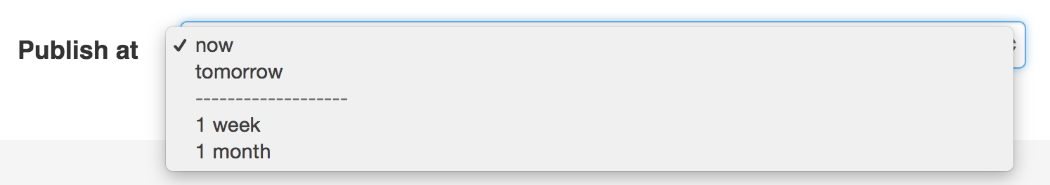
$builder->add('publishAt', ChoiceType::class, array(
'choices' => array(
'now' => new \DateTime('now'),
'tomorrow' => new \DateTime('+1 day'),
'1 week' => new \DateTime('+1 week'),
'1 month' => new \DateTime('+1 month'),
),
'choices_as_values' => true,
'preferred_choices' => function ($value, $key) {
// prefer options within 3 days
return $value <= new \DateTime('+3 days');
},
));This will "prefer" the "now" and "tomorrow" choices only:
Finally, if your values are objects, you can also specify a property path string on the object that will return true or false.
The preferred choices are only meaningful when rendering a select element
(i.e. expanded false). The preferred choices and normal choices are separated
visually by a set of dotted lines (i.e. -------------------). This can be customized
when rendering the field:
1
{{ form_widget(form.publishAt, { 'separator': '=====' }) }}trim
type: boolean default: false
Trimming is disabled by default because the selected value or values must match the given choice values exactly (and they could contain whitespaces).
These options inherit from the FormType:
data
type: mixed default: Defaults to field of the underlying structure.
When you create a form, each field initially displays the value of the corresponding property of the form's domain data (e.g. if you bind an object to the form). If you want to override this initial value for the form or an individual field, you can set it in the data option:
1 2 3 4 5 6
use Symfony\Component\Form\Extension\Core\Type\HiddenType;
// ...
$builder->add('token', HiddenType::class, array(
'data' => 'abcdef',
));Caution
The data option always overrides the value taken from the domain data
(object) when rendering. This means the object value is also overriden when
the form edits an already persisted object, causing it to lose its
persisted value when the form is submitted.
disabled
type: boolean default: false
If you don't want a user to modify the value of a field, you can set the disabled option to true. Any submitted value will be ignored.
empty_data
type: mixed
DEFAULT_PLACEHOLDER
This option determines what value the field will return when the submitted value is empty (or missing). It does not set an initial value if none is provided when the form is rendered in a view.
This means it helps you handling form submission with blank fields. For
example, if you want the name field to be explicitly set to John Doe
when no value is selected, you can do it like this:
1 2 3 4
$builder->add('name', null, array(
'required' => false,
'empty_data' => 'John Doe',
));This will still render an empty text box, but upon submission the John Doe
value will be set. Use the data or placeholder options to show this
initial value in the rendered form.
If a form is compound, you can set empty_data as an array, object or
closure. See the How to Configure empty Data for a Form Class article for more details about
these options.
Note
If you want to set the empty_data option for your entire form class,
see the How to Configure empty Data for a Form Class article.
Caution
Form data transformers will still be
applied to the empty_data value. This means that an empty string will
be cast to null. Use a custom data transformer if you explicitly want
to return the empty string.
:end-before: DEFAULT_PLACEHOLDER
The actual default value of this option depends on other field options:
- If
multipleisfalseandexpandedisfalse, then''(empty string); - Otherwise
array()(empty array).
empty_data
type: mixed
DEFAULT_PLACEHOLDER
This option determines what value the field will return when the submitted value is empty (or missing). It does not set an initial value if none is provided when the form is rendered in a view.
This means it helps you handling form submission with blank fields. For
example, if you want the name field to be explicitly set to John Doe
when no value is selected, you can do it like this:
1 2 3 4
$builder->add('name', null, array(
'required' => false,
'empty_data' => 'John Doe',
));This will still render an empty text box, but upon submission the John Doe
value will be set. Use the data or placeholder options to show this
initial value in the rendered form.
If a form is compound, you can set empty_data as an array, object or
closure. See the How to Configure empty Data for a Form Class article for more details about
these options.
Note
If you want to set the empty_data option for your entire form class,
see the How to Configure empty Data for a Form Class article.
Caution
Form data transformers will still be
applied to the empty_data value. This means that an empty string will
be cast to null. Use a custom data transformer if you explicitly want
to return the empty string.
:start-after: DEFAULT_PLACEHOLDER
label
type: string default: The label is "guessed" from the field name
Sets the label that will be used when rendering the field. Setting to false will suppress the label. The label can also be directly set inside the template:
1
{{ form_label(form.name, 'Your name') }}label_attr
type: array default: array()
Sets the HTML attributes for the <label> element, which will be used
when rendering the label for the field. It's an associative array with HTML
attribute as a key. This attributes can also be directly set inside the
template:
1 2 3
{{ form_label(form.name, 'Your name', {
'label_attr': {'class': 'CUSTOM_LABEL_CLASS'}
}) }}label_format
2.6
The label_format option was introduced in Symfony 2.6.
type: string default: null
Configures the string used as the label of the field, in case the label
option was not set. This is useful when using
keyword translation messages.
If you're using keyword translation messages as labels, you often end up having
multiple keyword messages for the same label (e.g. profile_address_street,
invoice_address_street). This is because the label is build for each "path"
to a field. To avoid duplicated keyword messages, you can configure the label
format to a static value, like:
1 2 3 4 5 6 7 8
// ...
$profileFormBuilder->add('address', new AddressType(), array(
    'label_format' => 'form.address.%name%',
));

$invoiceFormBuilder->add('invoice', new AddressType(), array(
    'label_format' => 'form.address.%name%',
));
This option is inherited by the child types. With the code above, the label of
the street field of both forms will use the form.address.street keyword
message.
Two variables are available in the label format:
%id%-
A unique identifier for the field, consisting of the complete path to the
field and the field name (e.g.
profile_address_street); %name%-
The field name (e.g.
street).
The default value (null) results in a
"humanized" version of the field name.
Note
The label_format option is evaluated in the form theme. Make sure to
update your templates in case you
customized form theming.
mapped
type: boolean default: true
If you wish the field to be ignored when reading or writing to the object,
you can set the mapped option to false.
read_only
Caution
The read_only option has been deprecated and will be removed in 3.0.
Instead, use the attr option by setting it to an array with a readonly key.
type: boolean default: false
If this option is true, the field will be rendered with the readonly
attribute so that the field is not editable.
required
type: boolean default: true
If true, an HTML5 required attribute will be rendered. The corresponding
label will also render with a required class.
This is superficial and independent from validation. At best, if you let Symfony guess your field type, then the value of this option will be guessed from your validation information.
Note
The required option also affects how empty data for each field is handled. For more details, see the empty_data option.